
On insight discovery – Recently I spoke with a Brand Director about how to find market space he can win and defend in the long run. The discussion shifted on the meaning of information and insights and, after an interesting debate on what’s insight at all[1], we found agreement by means of an example, which I’d like to present to you too.
Insight discovery: From data to information
The following table shows data on automobile brand perception gathered through a survey. 324 auto owners were asked, among other questions, For each of these brands mark the statements you agree with. The Total % column shows the frequency of occurrence of both row and column counts.
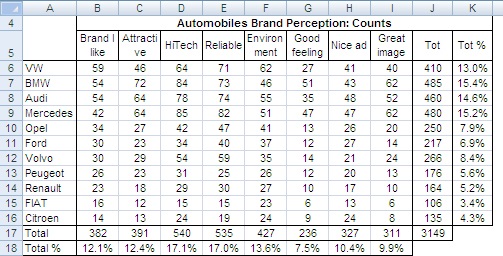
Table 1: Survey on automobile brand perception.
This table requires just a few simple data transformations to deliver information. For instance, we could transform it in row frequencies (percent row values adding to 100%), column frequencies (percent column values adding to 100%) and total table frequencies (percent values adding to 100% for the whole table). These transformations could help in better understanding the relationships within rows and columns.
Try LogRatio’s fully automated solution for the professional analysis of survey data.
In just a few clicks LogRatio transforms raw survey data into all the survey tables and charts you need,
including a verbal interpretation of the survey results.
It is worth giving LogRatio a try!
Although this is a fairly simple table, extracting insights useful to understand the relationships between its columns and rows appears to be quite a complex task. In fact, showing all this data using bivariate graphics would require several charts. In order to reduce the number of charts, and still have a meaningful picture, we could plot some series on only one chart. Plotting all series on a 3D chart would even reduce the number to one single image. Nevertheless, we would not be able to plot the overall relationships between rows and columns characterizing this data set. In other words, we would see the parts of the puzzle but we would not see the whole picture.
What we need here is some sort of analytical technology able to simplify, summarize and hopefully also explain our data. Multivariate statistics offer different tools for this, including: Multi-dimensional scaling, discriminant analysis, factor analysis and correspondence analysis. We can display the results of these techniques on informative maps that, when interpreted appropriately, provide insights useful for making strategic decisions.
Showing data relationships to discover insights
Multi-dimensional scaling (MDS) works well with intangible attributes, for instance, those emerging out of a survey study of advertising effectiveness where respondents are interviewed on their reaction to messages and their elements. This is not applicable to our case.
Discriminant analysis produces perceptual maps that tell us which attributes best distinguish or discriminate among, say, brands. Although this technique may produce useful maps, rating several brands on many attributes may result in a heavy burden for respondents, and the quality of data may be questionable. Moreover, there are technical aspects linked to the algorithm that impose a certain caution: maps may suffer instability and change dramatically under certain conditions, trivial attributes may be given undue importance, and omitting important attributes from the analysis is always possible, which would result in an incomplete picture.
Factor analysis identifies groups of attributes among, say, products described by several attributes which are more similar. The groups are assembled in vectors, which can be displayed on a map. The data required for the analysis is in the form of ratings for several product attributes. When a key feature is omitted the analysis result may be heavily impacted, and choosing the correct attributes is not a trivial task. There should be several attributes describing one concept, and they should be measured with data on interval scales (factor analysis is not suited for the treatment of categorical data). The analysis requires rotating factors around the origin in order to interpret them properly, and this demands a certain level of expertise on the user side.
Correspondence analysis (CA) is what we need to analyze our data table. It draws maps showing the spatial relationships among row and column items. It uses categorical data from almost any kind of rectangular matrix of positive numbers, most often a contingency table; it is a flexible technique that can handle very different kinds of data; it produces an effective graphical display and its interpretation becomes possible even after only a short technical introduction[2].
We used CA, to analyze our table above (only the range A5:I16), which produced the following map:
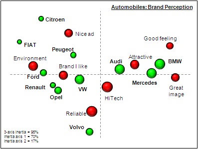
Map 1: Correspondence analysis of automobile brand perception.
We won’t discuss the technical details of how the CA technique works. All we need to know at this point is that: (1) one bubble represents either a row or a column profile; (2) the closer together the bubbles lie on the map, the stronger their relationship; (3) the size of the bubbles, in this case, resembles the size of the counts from the table; and (4) the axes have no meaning. This last point may confuse new users of CA. In fact, what should be interpreted is not the relative position of bubbles on the map but rather how bubbles cluster together. Read on and everything will be made clear.
Book suggestion: Mapping Markets for Strategic Purposes.
To identify meaningful clusters of bubbles we input the first three coordinates of the CA to the cluster analysis software. The next image shows the groups we found (with the Ward’s algorithm). This gets us closer to producing strategically useful insights.
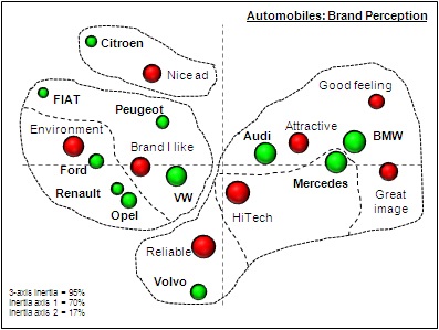
Map 2: Clusters of the correspondence analysis of automobile brand perception.
Discovering insights
The map above helps us to identify market segments as well as to profile competitors accordingly. The segments are to be found in the spread of the bubbles. With the Cluster Analysis we circumscribed portions of the map, delimiting groups of associated profiles. Associated profiles refer to a commonality of performance, behavior and belief. For instance, would we expect a significant difference between the behavior and beliefs relating to cars of someone buying a new BMW as the main family car and someone else opting for a FIAT? What are their expectations? How does their concern about the environment differ? What is their wealth status? And so on. We can reasonably expect the two persons to differ considerably in their usage and attitude toward cars, and so do the brand profiles of the cars targeting them. Brilliant analysts can bring these differences to the surface and make them evident using prior knowledge when segmenting maps.
Forget the horizontal axis for a moment and focus only on the vertical (second) one. Citroen and Volvo lie at opposite extremes of the same axis, each with an attribute near it. These are two groups and within each group the brand profile is closely associated with the attribute near it. The association can be verified in the raw data. Looking back to the data table, we see that both brands have the largest number of counts exactly matching the attribute lying close to them on the map (transform the table into percent values to prove this statement). The same reasoning applies to the horizontal (first) axis, with the difference that here both groups host two brands. That is, two brands share a similar profile.
From insights to strategic decisions
It is now time to organize the findings in a synthetic, structured and business-oriented manner that can drive decision-makers straight to the heart of the data: the insights[3].
A market environment characterized by two main dimensions emerges out of this dataset. The horizontal axis seems to be referring to a financial or exteriority concept, while the vertical one presents the signs of an intellectual or introspective dimension. We assigned the labels shown in the following picture to describe the market space.
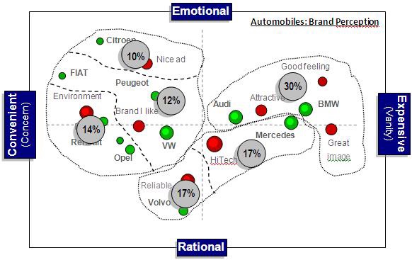
Map 3: Dimension interpretation of the correspondence analysis of automobile brand perception.
We see a double-faced dimension taking form on the horizontal axis. The spread of the brands suggests they are shown from left to right according to an underlying financial dimension referring to the price of the cars. On the other side, the spread of attributes seems to show an underlying dimension of a soft nature. On the left side of the map Environment and Brand I like seem to relate to what we call an “Area of Concern” that is different from the “Area of Vanity” we intuit from the attributes on the right side of the map. Perhaps both dimensions can be used, because there is a certain link between the two. Expensive things often satisfy a need for self-esteem, while decisions such as buying a car that has respect for the environment or choosing the car that “I” like, as opposed to what the current fashion imposes, may relate to moderate prices.
The labels of the vertical dimension are basically driven by the attributes. The Nice ad opposed to Reliable car lets us imagine two users. The first one is subject to the influence of advertising and tends to perceive cars according to what s/he decodes out of the communication messages s/he is exposed to. On the lower side of the axis we imagine an individual judging rationally based on how the product performs rather than on what others say of it.
The crossing of the two axes gives rise to different client profiles based on their brand perception and preference. The six circles show in percent how many citations were registered for each cluster, which is simply the column total counts divided by the overall map total of cell J17. According to the identified clusters and their size, the market appears roughly split into three even segments:
-
- 36% Emotional convenience (top-left) is made of three sub-clusters. It hosts the largest number of brands, and the profiles within it seem to be spread rather broadly, which suggests there is room for positioning new brands. For instance, a (really) clean car with a reasonable price presented in an innovative and progressive way.
- 34% Rational expense (middle) is a market segment made of two sub-clusters each hosting one brand. Volvo is clearly differentiated from other brands while Mercedes is placed in the middle of a technological profile and a profile driven by emotion.
- 30% Expensive emotion (top-right) hosts two brands. There are no sub-clusters and this makes the segment look less differentiated in terms of brand perception image than the two other segments. Positioning a new brand here may prove harder and more expensive than in other segments.
Maps such as this can help marketers to make better informed decisions at the strategic level for both positioning and communication purposes because they show the market segments and they help in reasoning about the user profile behind each segment. This is what we understand under strategic insights, and this is the kind of inspirational data transformation required to shift the discussion to a higher level, namely: Strategic thinking.
[1] By definition data is a set of qualitative or quantitative values that create information useful for making decisions. Information informs about uncertainty and it measures the probability of occurrence of an event. Insight is the understanding of the cause and effect governing relationships and behaviors of related events.
[2] You might also be interested in the book Mapping Markets for Strategic Purposes. Read also the book review from the magazine Marketing Research of the American Marketing Association.
[3] For the sake of this example I must add I presented an interpretation based mainly on cluster analysis and on visual inspection of the map, although the original analysis was driven by an in-depth reading of the Theta angles as well as the CA coefficients (inertia, mass, contributions and squared cosines). You can find the original analysis in the book Mapping Markets for Strategic Purposes.