
1.LogRatio in a nutshell
LogRatio online software simplifies the process of analyzing survey data.
In a few clicks LogRatio transforms respondents’ answers to survey questions into a professional report like a top-tier market research agency.
Just faster, cheaper, and better.
And every survey user is a survey expert.
It works this way:
-
-
- You conduct a survey, for instance with SurveyMonkey or any other data gathering tool.
-
- When all interviews are in, export the data to an Excel file.
-
- Upload that file to LogRatio, answer a few questions, and hit “Start LogRatio”.
-
- In a few minutes LogRatio creates two files:
-
- An Excel file
-
-
containing professional cross tables, sample size analysis, descriptive statistics, and all the numbers you need for a professional analysis of your survey.
-
-
-
- A PDF file
-
-
containing the interpretation of the survey results written in plain English.
Doing this all by hand could take days to an expert market research analyst.
LogRatio produces better survey reports
With LogRatio you do not need to worry about how to analyze your survey data, which tests to perform, how to make a cluster analysis, how to evaluate the sample size, how to interpret survey results, or anything else. LogRatio shows you everything that is relevant, and you decide what to keep or not.
LogRatio turns the typical approach to surveys analysis upside-down.
- From: Do some analyses by hand (in days).
- To: Get everything (in minutes), just use what you need.
And every survey user is a survey expert.
2.User registration
Why do I need a User account?
Registering to LogRatio is free of charge and allows you to use LogRatio for the analysis and interpretation of surveys.
Moreover, your user account has a Profile page where all the reports you have created with LogRatio will remain accessible until you close your user account.
Create your User AccountDeliver professional survey analysis
Creating a User account
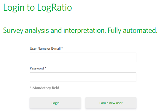
On the LogRatio website click “Try LogRatio” in the top-right corner of the screen. If you are already logged in, the main LogRatio page will display. If you are not logged in yet, you will be directed to the Login page.

Login
To log in to LogRatio simply enter your username and password in the Login form.
If you do not have a User Account, click “I am a new user”. The Register page will display.
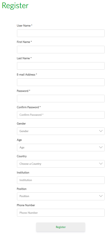
Registration
Enter the mandatory fields of the Register form and click “Register”.
Your account is created and you are directed to LogRatio for the analysis of your first survey.
That’s it.
Enjoy LogRatio. Work with better survey reports.
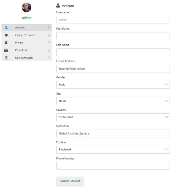
User Account
On the Account page hit the grey buttons to see and edit different parts of your user profile.
The following images show the elements in a user profile.
Account
This is the main Account page. You can update your email address and other elements on this page.
The username cannot be changed.
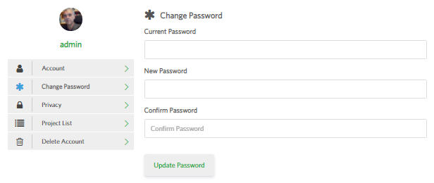
Change Password
This is the page where you can change the password used to access your LogRatio user account.
For security reasons, we encourage LogRatio users to change their password every now and then.
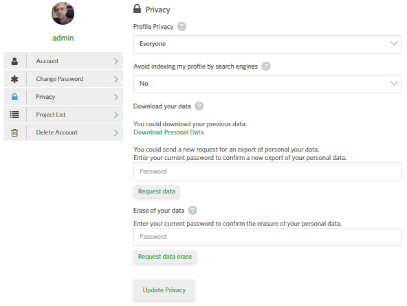
Privacy
On this page you decide how to manage the privacy of your LogRatio user account.
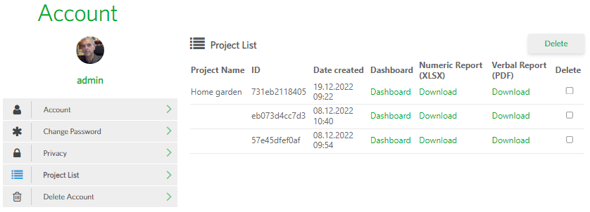
Project List
This page shows a list of all projects you have analyzed with LogRatio.
Past reports can be downloaded again, or they can be deleted permanently from the list.
The links Dashboard open the online report of each project.
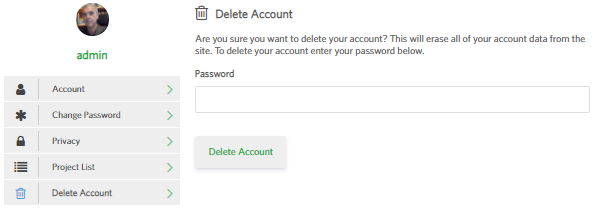
Delete Account
This page allows you to permanently delete your LogRatio user account.
This action cannot be reversed. Once your account is deleted, all reports and any other content connected to the account is deleted from LogRatio’s servers and cannot be recovered.
3.To marketing research instructors
Marketing research lessons can become too theoretical and lose the attention of your students.
To make marketing research lessons more dynamic and engaging, Global Analytics Systems offers our products and materials, free of charge, to instructors of Marketing, Marketing research, and similar subjects:
LogRatio and FakeDt
The ideal gym where modern decision-makers and analysts learn more, faster.
3.1.FakeDt: Teaching with synthetic survey data
FakeDt simulates survey data representative of the 2021 US population in terms of Age, Gender,
Income, Language, and Education.
Synthetic survey data for teachers.
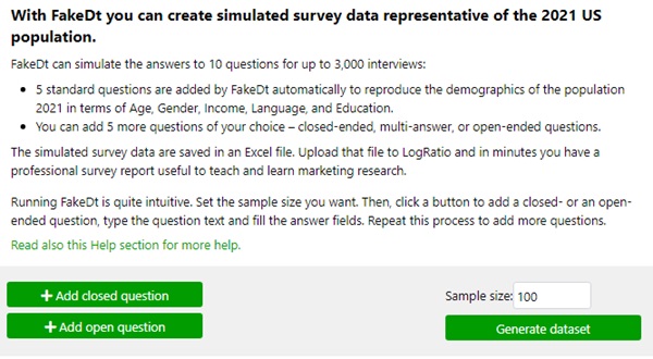
With FakeDt you can simulate the answers to 10 questions for up to 3,000 interviews:
-
- 5 standard questions reproduce the demographic data of the US population in 2021.
- You can add 5 more questions of your choice – closed-ended, multi-answer, or open-ended questions.
The instructions for running FakeDt are intuitive to follow.
The simulated survey data are saved in an Excel file that can be used with or without LogRatio.
Upload the FakeDt file to LogRatio and in minutes you have a professional survey report that includes:
-
- An Excel file with all the survey numbers your students need
- A PDF file with a verbal interpretation of the survey results
Use the Dashboard to navigate the report online.
Students learn more and faster when working with FakeDt and LogRatio.
Synthetic survey data for teachers.
3.2.FakeDt & LogRatio: The ideal gym for managers
FakeDt & LogRatio: A gym for managers
Today, marketing instructors can use FakeDt and LogRatio to teach in an engaging and dynamic way how professional researchers analyze and interpret surveys.
FakeDt simulates the data of a survey.
LogRatio turns those data into professional survey reports. In minutes.
It is like going to a gym of modern managers to exercise in analysis and interpretation of survey data,
ultimately learning to make better decisions.
Engage your students in creating synthetic survey data, alone or in a team setting.
Use LogRatio to analyze the data, and teach them how to uncover valuable information and insights.
Students working with FakeDt and LogRatio can exercise with:
-
- Survey data coding
- Sample size and error levels
- Different answer scales for the same question
- Descriptive statistics, including histograms and box-plots
- Correlations between survey questions
- The results of cluster analysis, including the crosstabs of clusters vs. survey questions
- Professional cross tables, including: Independence test, correlations, counts, percentages, test of the significance of differences, and error levels
Train your students to become better managers.
Teach your Marketing Research lessons with FakeDt & LogRatio.
P.S.
The LogRatio Blog posts are worth a visit – they provide a wealth of Marketing Research and Strategic Marketing information.
3.3.How to use FakeDt
FakeDt simulates survey data.
Also known as synthetic survey data, simulated survey data can be very useful to teach and learn marketing research.
To start the FakeDt tool, click on the “Synthetic data” option from the LogRatio Menu.
In the page that opens you can define up to 5 questions to create survey data for.
The data to 5 other questions is created by FakeDt by default. This data reproduces the 2021 demographics of the US population in terms of age, gender, income, language and education.
When you are done, define the “Sample size”, click the button “Generate dataset” and an MS Excel file containing your synthetic survey data is created. This file can then be uploaded to LogRatio, and used to create a professional survey report that is useful for teaching and learning marketing research.
For more information, read this Help section.
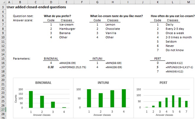
Closed-ended survey questions: How to create synthetic answers
To create the answers to a closed-ended question click on the button “Add closed question”. The following form appears.
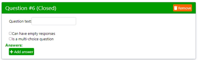
Type the question text, for instance, as shown in the image below.
Remember, for more readable reports, keep question text brief.
By default, FakeDt creates single-answer closed-ended questions.
To create data for a closed question with multiple answers, check the box “Is a multiple-answer question”.
Check the box “Can have empty responses” to simulate respondents who do not answer this question.
Next, click the button “Add answer” and type the class label. Repeat this operation to create as many answer classes as required for this closed-ended question.
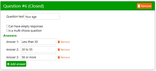
Remember, adding too many answer classes dilutes the data frequencies and may return weak survey data. In general, between 3 and 9 answer classes should provide acceptable results, provided the sample size is large enough. Samples as large as 384 interviews are common in marketing research because they imply ‘reasonable’ Confidence (95%) and Error (5%) levels.
Again, keep answer labels brief for a more readable report.
Open-ended survey questions: How to create synthetic answers
To create the answers to open-ended questions, click on the button “Add open question”. The following form appears.

Type the question text, for instance, as shown in the image below.
Remember, keeping texts short helps the readability of the report.
Check the box “Can have empty responses” to simulate respondents who do not answer this question.
There are two steps to instruct FakeDt on how to create the answers to an open-ended question:
- Add a topic
- Add some keywords related to the topic
For instance, the image below shows two topics and several keywords assigned to each topic.
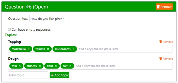
Use single words for both topics and keywords.
You can add as many topics and keywords as you deem appropriate.
The larger the sample size, the more topics and keywords are needed.
In general, between 3 and 7 topics and between 3 and 10 keywords per topic produce reasonable data.
Be aware that FakeDt produces open-text answers that may seem weird to the human eye. However, they are fine for LogRatio, our online software that automates the production of professional survey reports.
3.4.How FakeDt produces synthetic data
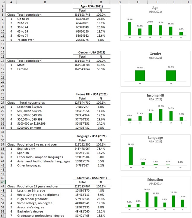
By default, FakeDt creates synthetic data for 5 questions that reproduce the 2021 demographics of the US population in terms of age, gender, income, language and education.
The following image shows the classes and the frequencies of the original data from the US census.
In order to produce synthetic data close to the original census data, create a sample size with a small enough error level.
How FakeDt produces synthetic data for user-defined questions
FakeDt applies different approaches to create synthetic data for different kinds of survey questions: Closed-ended with single answer, closed-ended with multiple answers, and open-ended questions.
A description of each method follows.
Synthetic data for closed-ended questions with single answer
To create the synthetic data of closed-ended questions with a single answer, FakeDt randomly selects one of three different probability distribution functions (PDFs):
-
- BINOMIAL
- INTUNI (INTEGER UNIFORM)
- PERT
The parameters of the PDFs are determined by FakeDt according to the number of answer classes defined by the user.
The image below describes the three PDFs.
The bold parameters are estimates:
-
- BINOMIAL estimates the bold parameter with a random value in the interval UNIFORM(0.25;0.75) PDF, and returns random data from right skewed to left skewed, accordingly.
- PERT estimates the bold parameter with a random value in the interval INTUNI(min+1;max-1) PDF, which returns any random integer in the interval. Min and max refer to the min and max number of answer classes
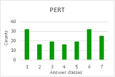
Synthetic data for closed-ended questions with multiple answers
The synthetic values of each answer class of closed-ended questions with multiple answers are produced with the PERT PDF.
The input parameters are as follows: Min = 0, Max = 1, and the Mid value is a random value in the interval UNIFORM(0.20;0.45).
The following chart shows an example of the answer frequencies that such a PDF can return.
Synthetic data for open-ended questions
The synthetic answers to open-ended questions are produced with an NLP algorithm resembling the process described in Alnajjar and Toivonen.
Based on the Topics and the Keywords entered by the user, the algorithm extracts related words and combines the three kinds of words in predetermined skeletons of sentences. Presently, we generate related words with a Spacy model, where the relatedness is measured with cosine similarity and 0.75 is the threshold.
The text produced with this approach may sound unusual to the human ear, although it is perfectly viable for the purpose of coding and classifying the answers as required by open-ended answers.
Sources
Khalid Alnajjar, Hannu Toivonen (2020). Computational Generation of Slogans. Natural Language Engineering, I-33.
G. Malcolm, J. H. Roseboom, C. E. Clark and W. Fazar. Application of a Technique for Research and Development Program Evaluation. Operations Research, Vol. 7, No. 5 (Sep. – Oct., 1959), pp. 646-669.
Catherine Forbes, Merran Evans, Nicholas Hastings, Brian Peacock (2011). Statistical Distributions. John Wiley & Sons, Inc.
4.Survey analysis with LogRatio
LogRatio is fully automated. This means, it takes just a few clicks to run a professional analysis of a survey.
Login to LogRatio and click “Menu” in the top-right corner of the screen to go to the page where you can run LogRatio.
If you want to try LogRatio but do not have your own survey data, don’t worry, there are test data you can use to try LogRatio (read also the orange flag in the next image).
If you already have your own survey data read section Survey data: How to format your input file.
Click “Next >” and enter the fields on the new page.
If you do not know what to enter in the fields “Population size”, “Confidence level” and “Population proportion”, you have two options:
- Accept the default values shown in the fields
- Read the tip that displays when you hover over the small icon to the left of each field and act accordingly
Try LogRatioFully automated survey reports
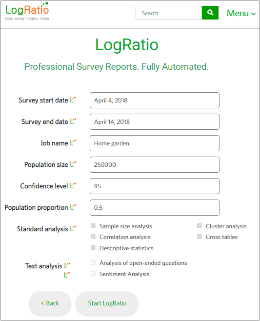
The “Sentiment analysis” checkbox is currently disabled. We are working to make it available soon. Sentiment analysis identifies positive and negative answers to open answers and codes the input data appropriately for further analysis.
Click “Start LogRatio” and the survey report is on its way to you.
The following screen confirms that your survey is being processed and shows the elapsed time to process your data and write the report.
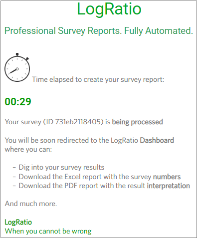
When processing is complete, you will be redirected to the online report, called Dashboard.
This is all you need to know to use LogRatio.
To ensure that you get the most out of LogRatio, we encourage you to read the remaining parts of this User’s Guide:
4.1.Input file: How to format your survey data
LogRatio analyzes and interprets survey data saved in a CSV or MS Excel (xls, xlsx) file format.
The number of columns (questions) allowed in a survey is unlimited. However, files with many columns of data are not recommended.
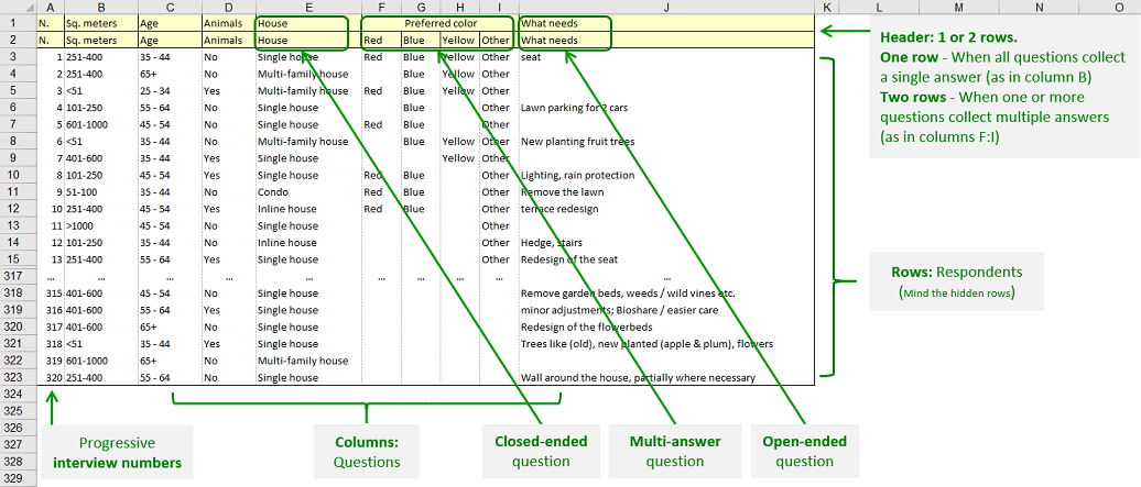
The following image shows how to arrange the input data for LogRatio. Detailed explanations follow.
Requirements
The data must be in the first sheet of an Excel file with extensions XLS and XLSX.
One row of the data table hosts the answers to all questions of a single respondent.
One column of the data table hosts the answers to a single question of all respondents.
LogRatio recognizes three kinds of input data:
- Closed-ended, single-answer questions
- Closed-ended, multiple-answer questions
- Open-ended questions
The first row of the table, called table header, hosts the text of each question.
Depending on the kind of closed-ended question, the second row may take two different shapes.
When in a survey there is one or more closed-ended question that allows multiple answers, the header requires a second row, as in the image above. The first row contains the questions while the second row of the table header ():
- For open-ended questions and for closed-ended questions with single answer, contains a repetition of the question text, as in the row above it.
- For closed-ended questions with multiple answers, the second row contains the answer options, each one in a single column. In other words, closed-ended questions with multiple answers occupy as many columns as their answer options.
Leave blank cells for missing answers.
Use commas only in open-text answers. Do not use commas in the text labels of answers to closed-ended questions.
Remove columns of continuous and static values. Continuous data could be dates and time, IP address numbers, and the like. Static values could be the account number at an online survey provider, the day of data collection, the answer to a filter question, or other column with the same value in all of its cells.
Suggestions
- Your input data to LogRatio can be in any language. However, the PDF report will be produced in English.
- Special characters, like ö, ä, ç, ñ, ǽ, etc., could be misinterpreted and reported in the wrong way.
- Keeping the text of questions and answers brief results in cleaner, easier-to-read reports.
- In the answer options to closed-ended questions, express numbers in figures rather than words. For instance, write “1 to 5” rather than “One to five”. This helps in sorting them appropriately, which is a useful feature when reading reports. In general, do not use plain numbers, like “1”, “250”, etc.
- Make sure the respondent answers are written in a consistent manner. For instance, “I agree” is different from “ I agree” and “I Agree”.
- The Data>Filter feature of Excel is an excellent tool to check the consistency of the answer labels to each question.
- Grouping data wisely may result in reports that are easier to read and use. For instance, it may help by grouping:
- All open-ended questions in successive columns and place them at the right end of the input table.
- Respondent demographic questions in a single block of columns at the beginning or at the end of the input file (before open-ended questions)
4.2.What LogRatio does with your survey data
This is a compact summary of the activities LogRatio conducts to analyze survey data.
LogRatio is a fully automated solution for the professional analysis of survey data. In just a few clicks LogRatio transforms raw survey data into all the survey tables and charts you need, including a verbal interpretation of the survey results.
It is worth giving LogRatio a try!
A. Statistical analysis of Survey data
-
- Import the raw data
- Test the compatibility of the input file holding the raw data of the survey
- Detect 3 kinds of questions (closed-ended, multiple-answer, and open-ended)
- Detect continuous variables and not relevant variables
- Coding of raw data in analysis-ready format, compatible with any statistical software
- Apply machine learning algorithms (NLP) for the automated classification of open-ended answers
- Compute (1) the sampling error level for the whole survey and (2) the sample size for different levels of sampling error and confidence level
- Produce descriptive statistics for each closed-ended question, including box-plots, marginal totals, and histograms
- Measure Spearman-Rho and Eta correlation coefficients, appropriate for classified (nominal) variables of surveys
- Conduct two different cluster analyses (Ward’s method) to find homogeneous groups of (1) closed-ended variables and (2) survey respondents, including dendrogram charts
- Create the 2-way cross tables of all clustering partitions of respondents. Typically, 3 partitions: 2 groups, 4 groups, and 8 homogeneous groups of respondents. Each partition is cross-tabulated by each question of the survey
- Create the 2-way tables of each question crossed by all other questions, one at a time. Crosstabs include: Counts, proportions (percentages), significance tests, independence test of the two variables, as well as Rho and Eta correlation coefficients. Each table comes in two versions: With column totals and with row totals
- Create the Dashboard, an interactive online version of the report
B. Interpretation of analysis results in plain English
-
- Overall evaluation of sample size and sampling error with comments on how to reduce the cost of the survey (if repeated) without impairing the quality of the study
- Interpretation of the correlation analyses, including (1) reliability analysis and (2) detection of common constructs by means of the Cronbach Alpha coefficient
- Evaluation of the survey fatigue, including (1) the estimation of time required for a respondent to answer each question and (2) suggestion of improvements to reduce the respondent fatigue, in case the survey will be repeated
- Analysis of the (1) answer scale of each question and (2) morphologic analysis of the distribution of answers to a question, both useful to improve less performing scales
- Detection of outlier questions due to unusual distributions of the respondent answers
- Interpretation of the results of the cluster analysis conducted with respondents, including the identification of characterizing questions for each cluster
- Interpretation of each crossed table, including error levels by answer class, significance of the difference in proportions, independence between the variables of a table, and much more
- Creation of a compact summary of the survey results
5.Report 1: Online dashboard
When LogRatio completes the processing of the survey data, you will be redirected to the online report, called the Dashboard.
Use the Dashboard to view the LogRatio analyses of your data by clicking the applicable buttons at the top of the page.
Click the Download button to download the two files which make up the survey report: (1) an Excel file with all the survey numbers and (2) a PDF file with interpretation in plain English of those numbers.
FAQ
The Frequently Asked Questions (FAQ) page provides answers to questions commonly asked by LogRatio users.
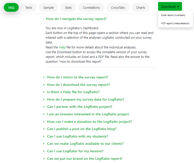
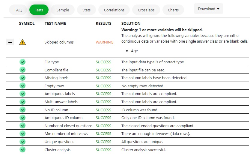
Tests
LogRatio conducts several tests on the user input file.
When something goes wrong LogRatio issues a Critical message, explains how to fix the problem, and stops working.
Warnings inform of something LogRatio considers anomalous, yet do not require any action on the user side.
Sample page
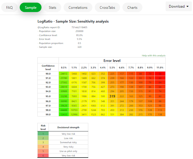
The Sample page reports the amount of risk your sample carries. For example, 5.5% in the image below.
Read also section SAMPLE SIZE ANALYSIS of this User’s Guide.
Page Stats
Select one of your survey questions from the listbox on the Stats page to view a summary of the main statistics for that question.
Only closed-ended questions are listed.
Read section DESCRIPTIVE STATISTICS of this User’s Guide for a description of the values on this page.
Correlations page
Correlation analysis studies the relationship between two variables. LogRatio produces two kinds of correlation coefficients: Rho and Eta.
On this page of the Dashboard you will find the correlation coefficients of all pairs of closed-ended questions in your survey data.
Read also section CORRELATION ANALYSIS of this User’s Guide.
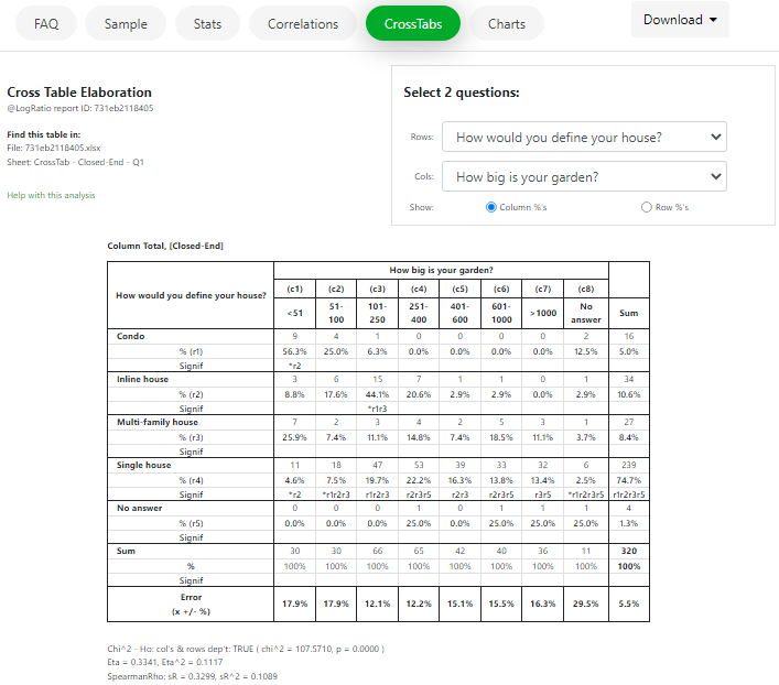
CrossTabs page
Contingency tables, aka cross tables or crosstabs, are perhaps the most used tool by professional survey analysts because cross tables dig deep into survey data in a systematic way. CrossTabs turn data into information that can generate useful insights.
All questions of your survey are listed on this page, including closed-ended, multiple answer, and open-ended questions.
To create a new cross table, select from the listboxes the two questions you want to cross tabulate.
That’s it.
To know more about LogRatio’s professional cross tables, read also section CROSS TABLES of this User’s Guide.
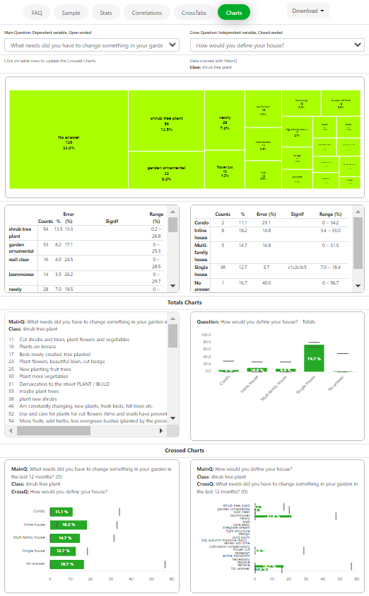
Charts page
On this page you can dig deeper into crossed variables.
Select two questions from the listboxes at the top of the page and several tables and charts appear.
Charts and tables change, depending on whether the Main variable (left side) is a closed-ended, an open-ended, or a multiple answer question.
Click on the tables to see how the charts change.
The easiest way to understand how the data on this page work and how they were pulled together is to select the same two variables on the CrossTabs page, then see how those numbers are reflected on the Charts page. This is much easier than explaining it in words.
6.Report 2: Numerical analyses, Excel file
The numerical report has four major sections:
- Dataset
- Uni- & Bivariate Analyses
- Cluster Analyses
- Cross Tables
Each section contains several sheets and each sheet contains information relevant to the correct analysis and interpretation of survey results.
The content of the Excel sheets of the numerical report is explained under each analysis of Section 6 of this Help document.
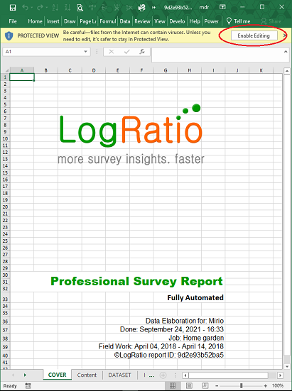
Note: When opening the LogRatio Excel report you may see a button “Enable Editing” under the menu ribbon. Click on it to display the file in editable mode.
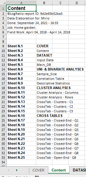
Content
The Content sheet shows the list of sheets in the LogRatio Excel report, and offers a convenient way of accessing each sheet: Click on any sheet name to jump into it.
7.Report 3: Verbal interpretation, PDF file
LogRatio reports are made of two files:
- The Numerical report, the Excel file
- The Written report, the PDF file

These files are created at the end of the processing of your market research data, as described in section Analyzing surveys with LogRatio.
The comments in the PDF written report are based on the analysis results in the Excel numerical report.
LogRatio inspects the Excel file at the single variable (question), bi-variate (such as correlations and cross tables), and single value levels in order to identify anomalies, over-representations, patterns and other relevant findings useful for making better informed decisions.
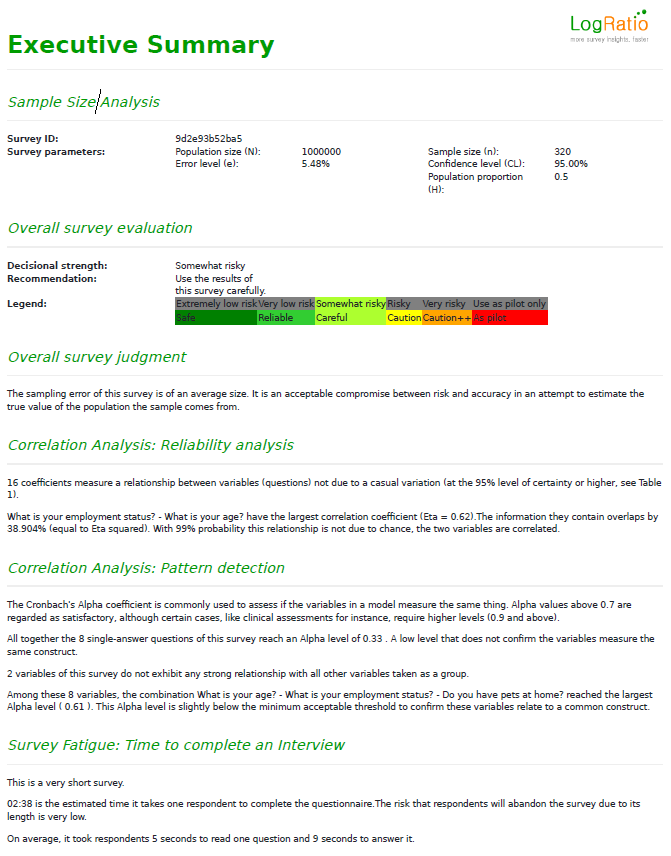
7.1.EXECUTIVE SUMMARY
The Executive summary provides a selection of relevant comments from the single analyses conducted by LogRatio.
The meaning and usage of the single comments is explained in the chapter concerning the single analysis.
7.2.DATASET
Order brings clarity and helps in understanding things better. LogRatio gives order to your survey data.
Your data is coded appropriately and stored in an Excel sheet ready for additional analysis.
This section of the LogRatio User’s Guide explains only matters related to the user input data. Other topics related to the analysis of survey data and their interpretation are discussed with the explanation of the relevant analysis tool.
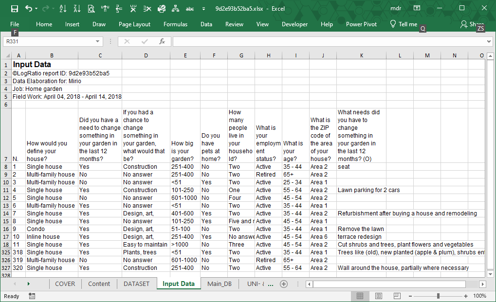
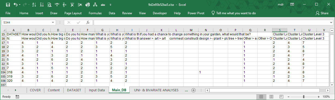
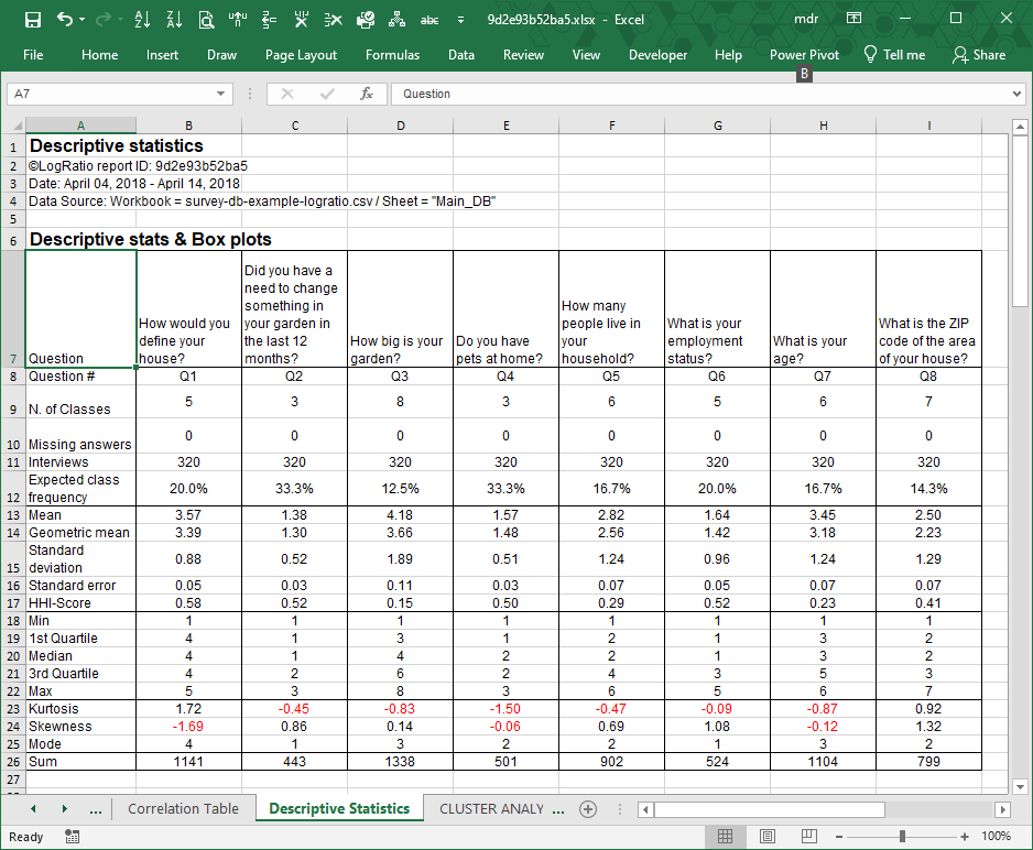
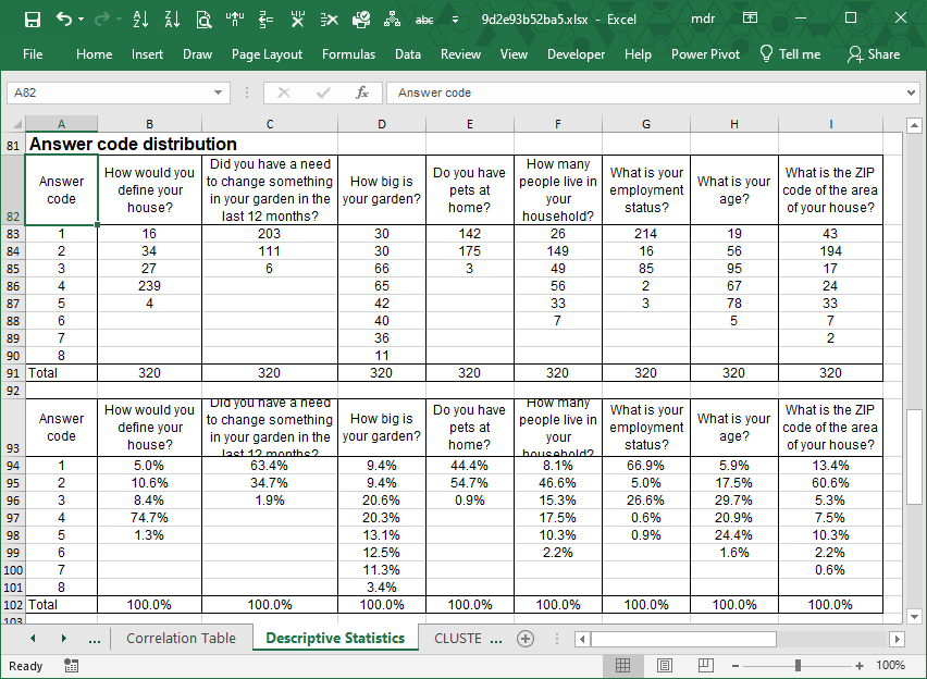
There are two sheets in the Excel report of LogRatio: Input Data and Main_DB.
Input Data
This sheet shows the original input data as supplied by the user.
Main_DB
This sheet shows the original input data coded in analysis-ready format. LogRatio’s algorithmic engine uses this dataset.
The frame code, on top of the sheet, shows the question text, the type of question (closed- or open-ended), and the single answer options to each question. The last three columns of the following image are created by the cluster analysis using respondent data by row.
Note: Question “If you had a chance to change something in your garden, what would that be?” is present in sheet “Input Data” but it is not in sheet “Main_DB” because it was not recognized as a closed-ended question due to the commas in the answer labels.
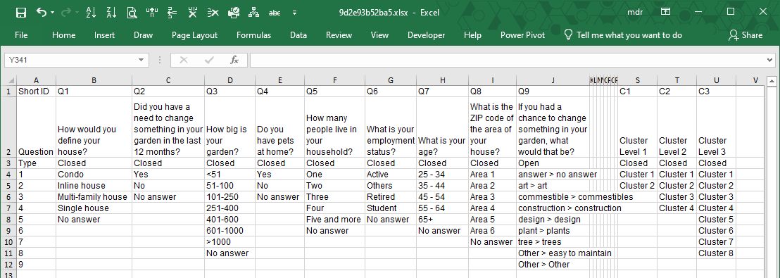
Right under the frame code there is the input dataset in coded format.
The number 4 in cell B17 of the image that follows means “Answer option number 4 to the closed-ended question Q1: How would you define your house?”
From the frame code we see that code 4 to question 1 corresponds to answer “Single house”. Therefore, code 4 means that respondent number 1 answered “Single house” to question: “How would you define your house?”
The data in the original input file needs coding in order to be properly analyzed.
LogRatio does it all for you.
Open-ended questions are also coded, but differently from the closed-ended questions. Open ones first need to be classified.
To classify open text, LogRatio uses different techniques of the Natural Language Processing (NLP). Our solution is not perfect yet. We are still working on it and every significant improvement we make is added to the algorithm. Chances are that at the time you are reading this help material the quality of open-text coding has improved already.
In the image above, columns J:R refer to one single open-ended answer coded in 9 answer classes (see frame code, column J).
The last three columns host the coding results of the cluster analysis.
In column S all respondents are split in two homogeneous clusters, in column T they are split in four clusters, and in column U all respondents are split in eight clusters (see columns S:U of the frame code). The values in these three columns are used to make cross tables useful to identify common tendencies among groups of respondents with similar characteristics. More about clusters in section “Cluster Analyses”.
7.3.SAMPLE SIZE ANALYSIS
Sampling is like cooking spaghetti. You try one strand to see if they are all cooked. In doing so, you run the risk of saying the pasta is cooked when it is not.
Making a mistake when cooking at home may be disappointing, but how much more risk are you taking when making decisions with an online sample survey?
The Sample Size analysis report of LogRatio tells you exactly this: The amount of risk your sample carries.
A clear and detailed understanding of the sample you are using is important to:
- Contain the cost of the research
- Interpret data correctly
- Reference the study correctly
- Support decisions with fact rather than gut feeling
Understanding your sample is the first step into the world of scientific decision-making.
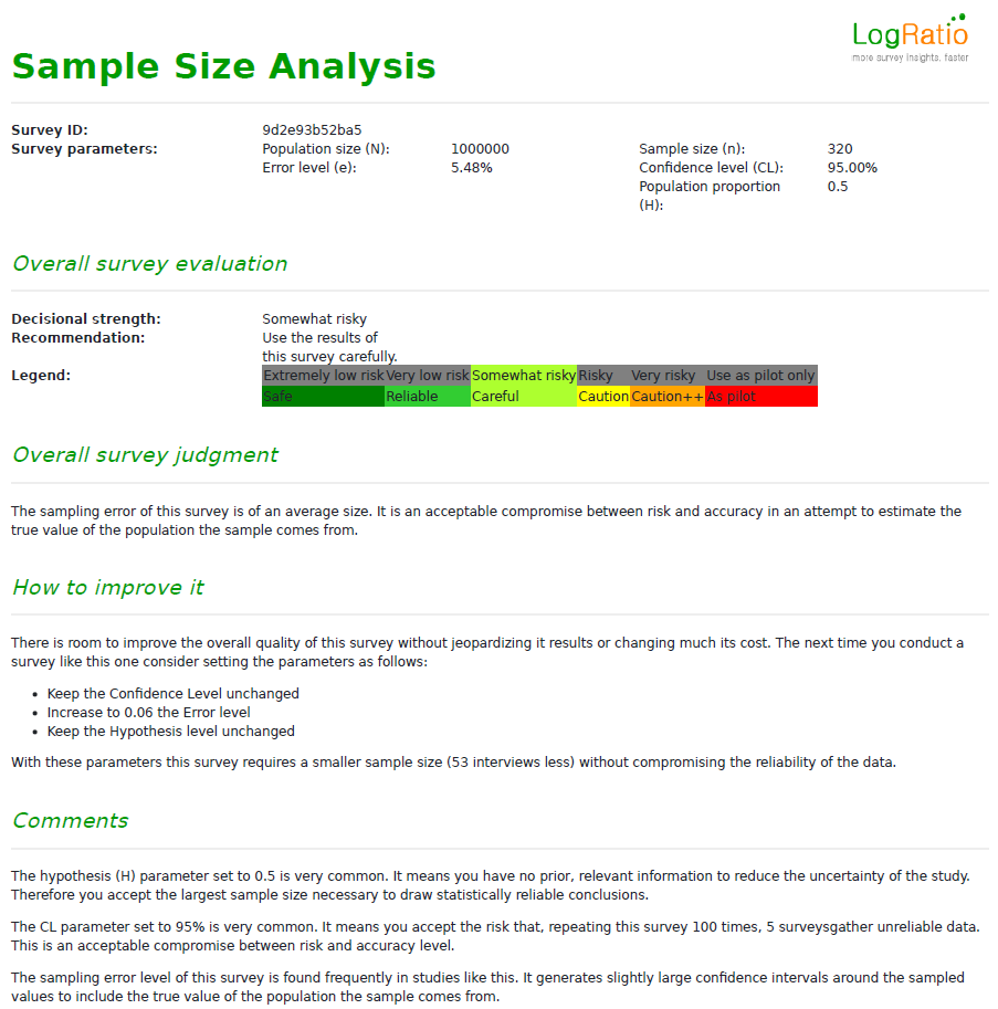
In order to judge the survey as a whole and to suggest how to improve it, in case it is repeated, LogRatio evaluates several parameters supplied by the user and computes the overall error level of the survey, as well as other measures.
LogRatio judges surveys according to 6 risk levels that decision-makers may incur when basing decisions on the information coming from a sampling research:
- Very low risk
- Low risk
- Somewhat risky
- Risky
- Very risky
- Use as pilot only
In general, the larger the error the riskier the results of the survey.
The lowest level of reliability suggests using the survey “As a pilot study only”. This means the results of the survey should be used only to refine the survey and repeat it in order to collect more reliable data. Other decisions should not be supported with such a risky sample.
How to use the Sample Size report
The Sample Size report shows how many cases (interviews) are necessary to estimate values consistent with the real values of the population the sample comes from. This consistency, or accuracy, can be set at different levels according to the Confidence and Error levels of the survey.
The Confidence Level
For a number of reasons, a sample can deliver wrong data. The confidence level of the survey accounts for this eventuality.
The typical confidence level of surveys used for business purposes is 95%, although 90% and 99% are also common levels. Setting the CL at 95% means in 5 cases out of 100 we accept the risk of extracting a sample that does not reproduce correctly the characteristics of the population it comes from.
Say we extract 100 samples from the same population. 5 samples deliver results that do not reproduce correctly the values we were interested in while 95 samples estimate correct data.
Is 95% an acceptable Confidence Level?
It depends on the decision we have to make. To forecast the winner of a political election presumably not1 while to estimate user preference between Product A and B the 95% could be an acceptable confidence level to generate useful survey data.
The Error Level
Intuitively, values estimated with sample surveys imply uncertainty. The Error Level (EL) of the survey measures this uncertainty. For the sake of sampling there are two relevant kinds of error:
- Pre-survey. The error level used to determine the size of the sample.
- Post-survey2. The exact error level we can compute only when the survey is complete.
A typical error level of business surveys is 5%, but it may vary remarkably.
Note: Beware of marketing research agency consultants defining the size of the sample based on your budget. You run a serious risk of wasting money. Plan your survey according to your need and then, eventually, find the statistical justification to any compromises you make to satisfy your budget constraints. For instance, you want to estimate a value in a tight interval but do not have the budget, you may either accept different confidence and error levels or you can lower the hypothesis of the study. More on this later in this document.
Setting the pre-survey error level to 5% we are implicitly stating we want to estimate values in the confidence interval (5%), were is the value to be estimated. For instance, we estimate the market share of Brand A (A) to be 19% with 5% error level. This value should be actually read as any value in the range 19%5%3 or any value in the range 14% – 24%.
Why is this important?
Because it answers a crucial question. Say we measure the daily time spent online by teenagers and we find girls spend on average 203 minutes and boys 232 minutes a day online.
Can we state Boys spend more time online than Girls?
Well, it depends on the error level.
At the 95% confidence level, a sample of 50 respondents, say girls, with an average of 209 minutes 36.74 minutes spent online a day estimates the average time in the interval 199-219 minutes. For 50 boys reporting on average 23256.4 minutes online the interval is 216-2485.
Now, given the two intervals overlap a rule of thumb suggests we cannot say boys spend more time online than girls6. This concept goes under the name Significance Test. But, no worries. LogRatio does it all for you and explains it all in plain English.
Overlapping intervals are not significantly different.
Testing the significance of survey proportions (aka percentages) is important to avoid the risk of placing too much emphasis on values which in fact are not significantly different from comparable values. This in turn helps in avoiding wrong decisions.
Done by hand, testing values for significance is a tedious and time-consuming statistical exercise. We are lucky enough to have LogRatio do it all, fast.
Hypothesis of the study
This value can help you save money.
Most surveys set the Hypothesis of the study to 0.5, which means we do not have any prior knowledge of the subject of the survey that can help us reduce the size of the sample.
For instance, say we want to estimate the market share of our brand. Sometime earlier we had already conducted a comparable study which measured 35% of respondents preferred our brand. For this new study we can therefore set the hypothesis of the survey to 0.35, and the size of sample will shrink. The sample of a study at the 95% confidence, 5% error, and hypothesis equal 0.5 requires 384 cases. Reducing the hypothesis to 0.35 the sample size requires 32 interviews less, or 349 cases.
1Read the article “Brexit: Why Projections Were Wrong“ on how to interpret survey data: https://www.marketingstat.com/market-research-projections-brexit/.
2Computing the post-survey error level is important when the gathered sample size differs from the planned one.
3The confidence interval around a proportion is built with the formula: ![]()
4This is the standard deviation in minutes of all answers.
5The confidence interval around a mean (aka average) is built with the formula: ![]()
6To be able to do so we need a lower error level, which in turn increases the size of the sample.
Understanding how to set the hypothesis of a survey is important. You can save money and time; you use prior knowledge in a more economical way; and you act as a data scientist would.
Try LogRatioFully automated survey reports
7.3.1.Excel Sheet: Sample_Size
The first 7 rows of this sheet summarize the values provided initially by the user on the LogRatio website.
The “Error level” in B5 was computed by LogRatio based on the number of interviews. This is an important value.
The colored table below shows viable sample sizes according to varying values of Confidence and Error (with random respondent recruitment).
The greener the cell, the smaller the error and the more reliable the results gathered with that sample size. The more red, the larger the error, and the less reliable the survey results.
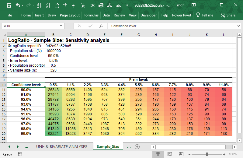
Note: Both samples of 56 or 62221 can be representative of the population they are extracted from. In fact, it is not the sample size that determines the representativity of the sample. It is the way respondents are recruited that matters in order to extract a sample that reproduces the characteristics of the whole population. LogRatio assumes respondents were chosen randomly.
Try LogRatioFully automated survey reports
7.3.2.Keywords: Sample Size
Confidence interval
Significance levels tell the researcher how likely a finding is the result of chance. Generally, researchers use the 0.95 (or 95%) confidence level to denote that a result is reliable. This means, in order to use a sample, as opposed to a census, we accept the risk of reaching wrong conclusions 5 times out of 100.
Error level
When interpreting the results of a survey, the researcher has a large number of tables of frequencies and percentages to examine. These results, being based on a sample, will be subject to sampling errors. The error levels LogRatio computes measure exactly these errors for a whole table as well as for the single columns and rows.
Random recruitment
LogRatio assumes the recruitment of respondents to a survey was conducted in a random manner. That is, every component of the population from which the sample is extracted has the same probability of being chosen.
Sample size
Is the sample size big enough? Does it provide results of sufficient statistical reliability to detect differences in the data which are not simply the result of casual variation?
Market researchers are well aware that it is not size that makes a sample representative of the population it comes from.
What really matters is to avoid gathering biased samples. Most often bias occurs when the respondent selection is, in some way, influenced by distorting factors, like human pre-conceptions and inability to screen sample components, e.g. of online surveys.
Sampling
Sampling is the act of selecting a given number of items, or persons, from a certain population. There are different ways of extracting samples: Random sampling, Systematic, Stratified, Quota, and others.
LogRatio assumes the survey sample it analyzes is a random one.
7.3.3.Literature to chapter Sample Size Analysis
Albright, S. Christian, Wayne L. Winston and Christopher Zappe (1999), Data Analysis & Decision Making. Brooks/Cole Publishing Company.
ESOMAR (2007), Market research handbook, 5th edition. John Wiley & Sons Ltd.
Green, Paul E.,Donald S. Tull (1978). Research for Marketing Decisions. Prentice-Hall Inc.
7.4.CORRELATION ANALYSIS
Correlation analysis studies the relationship between two variables. For instance:
- Negative correlation (as one variable increases, the other decreases). For instance, as the number of hunters in a region increases, the deer population of that region decreases.
- Positive correlation (the two variables increase or decrease together). For instance, as the level of perceived cleanliness in a restaurant increases the satisfaction of customers increases too.
Understanding the strength of the relationship between variables helps in avoiding redundant analyses and finding sometimes useful constructs, like those concerning emotions and believes. The strength of a relationship is measured by the correlation coefficient.
It must be remembered that correlation does not mean causation. Just because two variables are correlated it does not mean one causes the other. Once you are aware of this, correlation analysis is definitely a useful technique for decision-makers.
Different kinds of correlation coefficient have been developed over time, in order to account for the different ways variables are measured. Pearson product moment correlation coefficient is perhaps the most popular one (also available in MS Excel as the CORREL function).
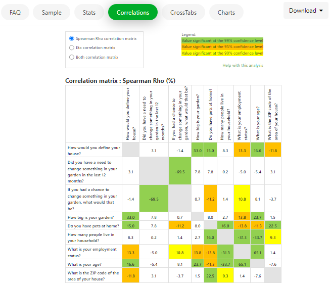
LogRatio uses two particular correlation coefficients to measure the relationship between categorical variables like those of respondent answers to survey questions: Spearman’s Rho and Eta.
LogRatio creates two correlation matrixes with the closed-ended questions of the survey: one with Rho and one with Eta coefficients. The relevant bi-variate relationships in these matrixes are commented and, more importantly, they are used to identify any existing sub-models in the data. Sub-models are groups of strongly related variables that may refer to the same unmeasured concept (also called construct or latent variable).
The sub-models LogRatio searches for aim to identify latent aspects (not measured with the survey) of the respondents’ behavior, beliefs, attitude, or other characteristic of potential interest to the analyst.
For instance: The management of a fast-food restaurant could be interested in the construct “Customer satisfaction” measured through the variables “Cleanliness, Quality of food, and Parking lots”. Such a model could show how its elements interact and how each element contributes to the overall satisfaction of customers. This information may help in allocating resources wisely, setting priorities, defining key performance indicators, and more.
The correlation analysis written report covers two topics: Reliability analysis and Pattern detection.
Try LogRatioFully automated survey reports
Reliability analysis
In this section LogRatio performs two operations:
- 1. It tests whether there are any non-linear correlations between variables, in which case it interprets the Eta coefficients. Otherwise, it interprets the Rho coefficients.
- 2. It uses the selected correlation coefficients to identify those pairs of variables with the largest and the smallest coefficients, because these variables show the strongest relationship and may suggest useful information to expert analysts.
Strong, meaningful relationships are seldom found. The challenge is to assess whether the association exists, how strong it is, and find practical applications for the new finding. Read the correlation matrix together with the values in sheet “Descriptive Statistics” of this report.
Caveat: LogRatio removes missing values pairwise. For instance, for any two variables, LogRatio computes the correlation coefficient only if a respondent answered both questions. Otherwise, both values for that respondent are removed.
Pattern detection
This section of the report checks whether the survey data contains one or more sub-models that could explain some latent aspects of the respondents’ behavior, beliefs, attitude, etc.
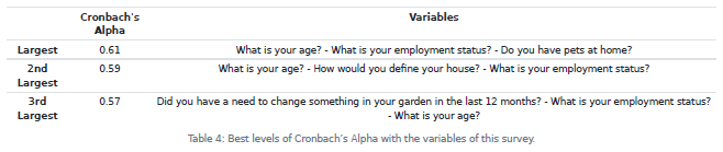
LogRatio inspects all permutations of three or more closed-ended questions (variables), hence a model or sub-model. It uses the Cronbach’s Alpha coefficient to assess if the variables in a model measure the same concept.
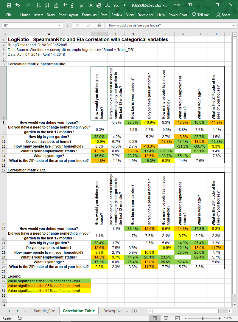
7.4.1.Excel Sheet: Correlation Table
This sheet hosts two correlation tables: The values of the first table are computed as Spearman Rho correlation coefficients; in the second table are the Eta correlation coefficients.
Rho coefficient measures the strength and direction of association between two ranked variables. It ranges ±100%, where negative values show an increasing negative correlation and positive values show an increasing positive one.
Eta coefficient measures a relationship, both linear and non-linear. It can never be negative, and it can be interpreted similarly to the Pearson correlation coefficient.
Non-white cells indicate significant coefficients at different significance levels: Green = 99%, Orange = 95%, Yellow = 90%. A significant coefficient means that what we are measuring with a sample can be assumed to be true also in the population the sample comes from, at different levels of reliability.
Try LogRatioFully automated survey reports
7.4.2.Keywords: Correlation Analysis
Categorical variables
Categorical variables are measured with answer scales consisting of a set of categories.
There are different types of scales. LogRatio recognizes the following three types:
- a. Nominal. The categories of these scales do not have a natural order. For example, travelling by: car, bike, bus, run.>
- b. Ordinal. The categories of these scales do have an order (although the distance between categories is unknown). For instance, likelihood to do something: Very likely, likely, … , completely unlikely.
- c. Interval. These variables have answer scales with an order and the distance between answer classes is measurable. For example, age or annual income.
Closed-ended questions
The form of a question may be either closed (i.e., of the type ‘yes’ or ‘no’) or open (i.e., eliciting free response). Closed questions may require respondents to select a single or a multiple answer. Questions that are open-ended ask respondents to supply the answer in their own words.
Coefficient of determination (R2)
This corresponds to the Correlation coefficient squared. It ranges from zero to one, where:
- A correlation squared equal to 1 means there is a perfect fit. The independent variable models very accurately the dependent variable. Therefore, this model is highly reliable.
- A correlation squared equal to 0 means there is a perfect unfit. The independent variable cannot model at all the dependent variable. Therefore, this model is highly unreliable.
- As squared correlation equal to 0.5 means the independent variable predicts 50% of the variation in the dependent variable. This is often regarded as a satisfactory correlation level for analytical purposes.
Correlation coefficient (R)
The correlation between two variables measures the strength of their relationship.
- A correlation near +1 means that there is a strong positive relationship between the variables. That is, when x is large, y tends to be large, and when x is small, y tends to be small too.
- A correlation near –1 means there is a strong negative association between the variables. That is, when x is large, y tends to be small, and the other way around.
- A correlation around zero indicates a weak association.
Correlation matrix
The correlation between more than two variables may be represented in the form of correlation matrix, which is a preliminary analysis useful for uncovering meaning hidden in the survey data.
Correlation analysis is particularly useful when seeking broad patterns in the data. In the pattern detection section, LogRatio reports on the existence of sub-models in the data that could explain latent aspects of the respondents’ behavior, beliefs, attitudes, etc.
When there are key variables in a survey (like satisfaction, interest, willingness to recommend, etc.), looking at their correlations with all other variables may reveal interesting relationships that could lead to reasonable hypotheses regarding the relationships between these variables.
Error level
When interpreting the results of a survey, the researcher has a large number of tables of frequencies and percentages to examine. These results, being based on a sample, will be subject to sampling errors. The error levels LogRatio computes measure exactly these errors for a whole table as well as for the single columns and rows.
Cronbach’s alpha
LogRatio uses Cronbach’s alpha to measure the reliability of a model made of variables measured with a survey.
Alpha estimates internal consistency, or the degree to which a set of items measures a latent construct. For instance, to measure the attitude towards our brand we may ask respondents to answer three questions with a 5-point Likert’s scale: Overall brand appeal, Price value, and Willingness to recommend. Cronbach’s alpha measures the likelihood that our three questions measure the latent construct “attitude” for our brand. That is, there is internal consistency in the three variables, they are on topic.
Cronbach’s alpha ranges between -1 and 1, although negative numbers arise only occasionally.
Alpha equal to 0.6 is a sort of practical threshold to separate consistency from inconsistency.
Alpha larger than 0.9 may indicate some redundancy in the model, that is, the contribution of one or more variables overlaps with other variables of the model and therefore there may be room to simplify the model by removing variables with a low contribution to the model.
Eta correlation coefficient (η)
Eta measures the correlation between variables, whether it is linear or not. Eta is ideal for categorical variables, like those used to gather the answers to survey questions. It can never be negative, and it is interpreted similarly to the Pearson’s correlation coefficient.
In general, the larger the value of Eta, the stronger the relationship.
Latent variable
There are two major types of variables: observed variables and latent variables.
Latent variables (constructs or factors) are variables that are not directly observable or measured. They are measured indirectly from a set of variables measured, in our case, with surveys.
For example, attitude, satisfaction, or preference can be modeled in the form of latent variables, whose value is measured through the answers to other questions. For instance, Purchase intention could be the latent variable of a model made of questions aimed at gathering judgements concerning: Product likeability, Price-value, and Brand credibility.
Non-linear correlations
Measuring correlation between two variables differs depending on whether the variables are related linearly or nonlinearly.
A typical example of linear correlation is Ice cream consumption and Air temperature. Sales of ice cream grow linearly in summer. On the other hand, a nonlinear relationship is that of Sugar quantity and Soda preference. Up to a certain point, more sugar makes the soda taste good, beyond that point, adding more sugar makes the soda taste worse.
Measuring a nonlinear relationship requires an appropriate correlation coefficient. LogRatio uses the Eta coefficient, which also has the advantage of being suited to test categorical variables. The popular Pearson’s coefficient of correlation (see function CORREL in Excel) measures correlation in linear relationships of continuous variables and cannot deliver satisfactory results with the categorical data of survey questions.
Pearson’s correlation coefficient
Karl Pearson’s coefficient of correlation (or simple correlation) is a widely used method of measuring the relationship between two variables. It assumes, among other things, that there is a linear relationship between the two variables. Therefore, it is not the ideal measure when dealing with categorical variables like those of a survey.
This coefficient measures the strength and direction of the linear relationship between two continuous variables, and it can range from -1 to +1.
In general, the larger the absolute value of the correlation coefficient the stronger the relationship. The sign of the coefficient refers to the direction of the relationship.
Rho correlation coefficient (ρ)
The Spearman Rho correlation coefficient, aka Spearman’s rank correlation coefficient, was developed to measure the correlation, whether linear or not, of data not expressed as an interval or ratio measurement. The categorical codes used to measure survey answers are most often of this kind.
Spearman’s Rho ranges between +1 and -1, and can be interpreted like the Pearson’s correlation coefficient.
Significance levels
Significance levels tell the researcher the likelihood that a value is the mere result of chance. Generally, researchers use the 0.95 (or 95%) confidence level to denote that a result is reliable.
Significance test
When survey data shows that 65% of respondents answered Yes to a certain question and 23% answered No, there is little doubt that a strong difference between the two groups of respondents exists.
But what about when 46% versus 51% answered Yes and No, respectively? Can we still say the data do not differ by chance?
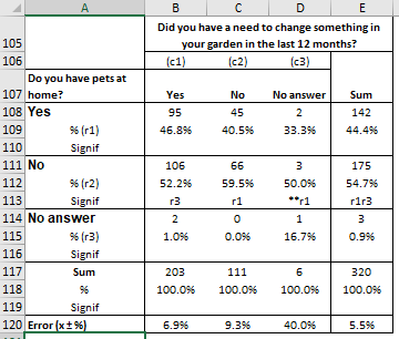
In order to answer this question, LogRatio employs the Z-test for testing the significance of difference between two proportions. For instance, “r1” in cell C113 of the following table means that the value 59.5% is statistically larger than 40.5% (r1) in cell C109. That is, with 95% probability the difference is not due to random variation.
Testing significance may prove very useful when screening large amounts of contingency tables of a survey. Significance values help in quickly locating those data that drive the most substantial differences in the tables.
Spearman’s Rho
Spearman’s Rho is a popular correlation coefficient, appropriate to measure the correlation of both continuous and categorical variables. Spearman’s Rho varies between -1 (perfect negative correlation) and 1 (Perfect correlation). Most of the rules applied to interpret the Pearson correlation coefficient apply to Spearman’s Rho as well. One peculiarity of Rho is that it assumes a monotonic relationship in the data, that is, high scores in one variable are related to high scores in the second variable and vice versa.
7.4.3.Literature to chapter Correlation Analysis
Agresti, Alan (2002). Categorical Data Analysis. John Wiley & Sons, Inc.
Carmines, E.G. and Zeller, R.A. (1990). Reliability and Validity Assessment. Sage University Paper.
ESOMAR (2007). Market research handbook, 5th edition. John Wiley & Sons Ltd.
Garson, G. David (2013). Validity And Reliability. Statistical Associates Publishing.
Kanji, K. Gopal (1993). 100 statistical tests. Sage Publications Ltd.
Schumacker, Randall E., Richard G. Lomax (2010). A beginner’s guide to structural equation modeling. Taylor and Francis Group, LLC.
Winston, Wayne L. (2014). Marketing Analytics: Data-Driven Techniques with Microsoft® Excel®. John Wiley & Sons, Inc.
Wright, Sewall (1921). Correlation and Causation. Journal of Agricultural Research, Vol. XX, No. 7, Jan. 3, 1921, 557-585.
7.5.DESCRIPTIVE STATISTICS
The Descriptive Statistics section of LogRatio’s report provides several measures that describe the data gathered with the single questions (variables) of a survey.
LogRatio applies Exploratory Data Analysis (EDA) techniques to explore survey data while searching for over- and under-representations, outliers, anomalies, and more.
LogRatio reads the results of the EDA analysis, suggests how to interpret the survey results, and makes suggestions for improving results, in case the survey will be repeated.
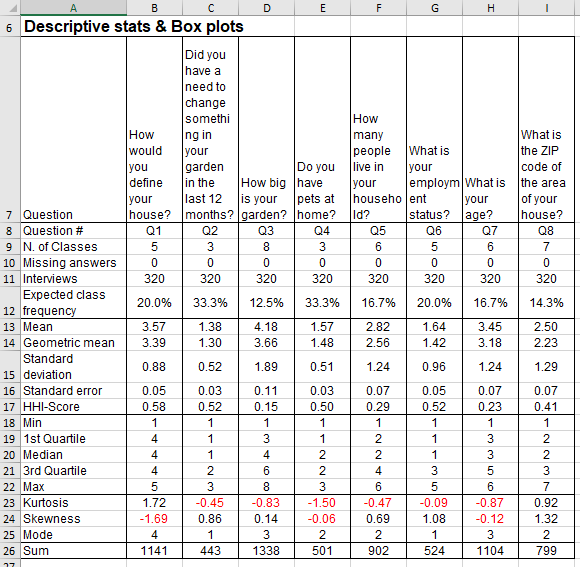
Read section Excel Sheet: Descriptive Statistics for a description of the rows of the image that follows.
Among others, the information in the Descriptive Statistics section of a survey report is useful for:
- Understanding better the respondent answers
- Identifying variables with unusual shape
- Feeding models, like Monte Carlo simulation
- Projecting results to the population level the data comes from
Try LogRatioFully automated survey reports
7.5.1.Survey Fatigue: Time to complete an Interview
The Survey Fatigue analysis estimates the amount of time required for respondents to complete the survey and makes suggestions on how to reduce it, where possible.
LogRatio reads each question and its answer options. It counts words, characters, and punctuation, and measures text complexity and ambiguity.
Then it estimates the average completion time for a respondent to read and answer the whole survey.
LogRatio transforms this information into recommendations on how to reduce the overall time to complete the survey questionnaire, projects the number of minutes and seconds that could be saved by applying LogRatio recommendations, and highlights questions and answer scales, if any, where saving time is reasonably possible.
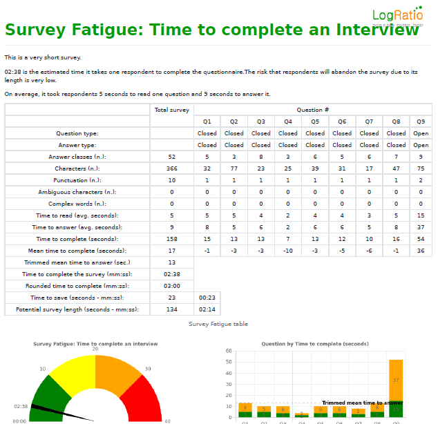
Question type (Closed, Open). LogRatio recognizes both closed- and open-ended question types.
Answer type (Single, Multi, Open). LogRatio recognizes two types of closed-ended question: single and multiple answers.
Answer classes. This field counts the number of possible answer classes to each question.
Characters. This field counts the number of characters in each question text.
Punctuation. This field counts the number of punctuation marks in each question.
Ambiguous characters. This field counts the number of characters in each question that may slow down the reading and understanding of the text. Ambiguous characters are, for instance: &, [, {, #, @, and others.
Complex words. This field counts the number of words in each question and answer option that may slow down the understanding of the text. Complex words are, for instance: instead, although, since, unless, whereas, while, and others.
Time to read (average seconds). This is the estimate, in seconds, of the time required to read each question.
Time to answer (average seconds). This is the estimate, in seconds, of the time required to read the answer options of each question.
Time to complete (seconds). This field shows, in seconds, the overall sum of the time required by the average respondent to read and answer each question.
Mean time to complete (seconds). In the first cell of this field, column Total survey, is the estimated average time it takes respondents to answer one question of the survey. The remaining cells show the difference between the time to complete a question and the average time to answer one question. This information allows you to identify questions requiring an above average amount of time to respond, which is a potential source to reduce the respondent fatigue.
Trimmed mean time to answer (seconds). This value is the estimated average time it takes respondents to answer one question computed removing the most extreme values: the longest time and the shortest time to answer.
Time to complete the survey (mm:ss). This is the estimated time, in minutes and seconds, it takes a respondent to complete the survey.
Rounded time to complete (mm:ss). This is the rounded “Time to complete the survey”.
Time to save (seconds and mm:ss). This is the weighted amount of time that could be saved by rephrasing some questions and answers.
Potential survey length (seconds and mm:ss). This is the estimated time the survey could last after rephrasing.
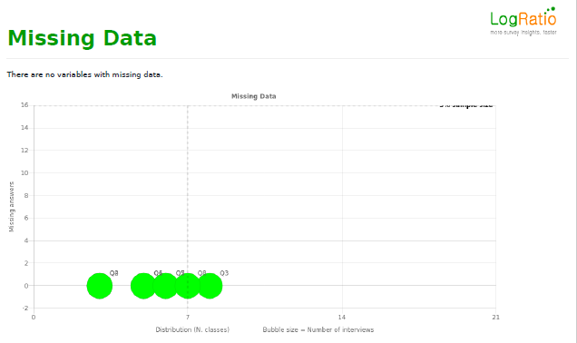
7.5.2.Missing Data
LogRatio inspects the missing answers of a survey, if any, and makes suggestions on how to improve the data gathering process, in case the survey is repeated.
Large numbers of missing answers to one or more survey questions increase the error level and therefore produce broader confidence intervals, which in turn increase the uncertainty of a decision.
Answer Classes
The analysis of the answer classes of a survey question applies mainly to rank-ordered answer scales, which are scales in ascending or descending order, like a Likert’s scale.
In the PDF report LogRatio plots on the Accumulation – Distribution Grid the questions of a survey according to their number of answer classes, called Distribution (horizontal-axis), and according to the concentration of respondent answers across classes, called Accumulation (vertical-axis) and represented by the Herfindahl index, HHI. The bubble size refers to the estimated time to read and answer the question.
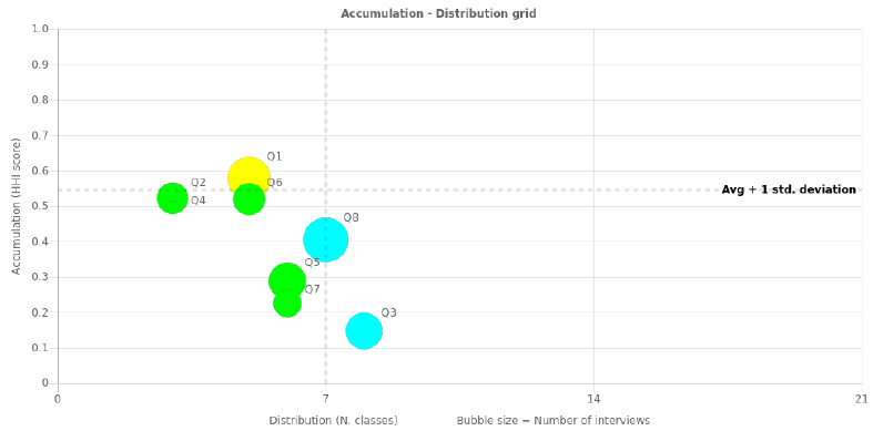
The horizontal-axis of the grid splits at the 7th answer class, in accordance with research that recommends using answer scales with 3 to 7 classes. Less than 3 classes could result in unrealistic answers while allowing more than 7 answer classes increases the risk that respondents will start using their own scale, so giving questionable answers.
The vertical-axis separates HHI-scores larger than the threshold from the rest. The threshold is set at the average score plus one standard deviation of HHI. Questions above the threshold level have an accumulation of answers in one or more classes, which makes them good candidates to look for significantly larger answer classes, because they could supply strong evidence to support decisions and insights.
Bubbles in the upper region of the grid are candidates for scale review because their answers are concentrated on one or few answer classes.
In this example, for instance, Q1 and Q6 present signs of concentration on certain answer options and it is worth checking if changing the scale would result in a lower level of concentration of the answers.
7.5.3.Morphologic analysis of respondent answers
LogRatio’s Morphologic analysis aims to identify, in a very concise manner, closed-ended survey questions with an atypical distribution of the respondent answers across classes.
The Morphologic Grid is the tool that points the user directly to those questions that might suffer from an inappropriate answer scale, due to a high or low concentration of respondent answers on a few or many classes, respectively.
Each question is plotted on the grid according to Skewness and Kurtosis as they are reported in the table of sheet Descriptive Statistics.
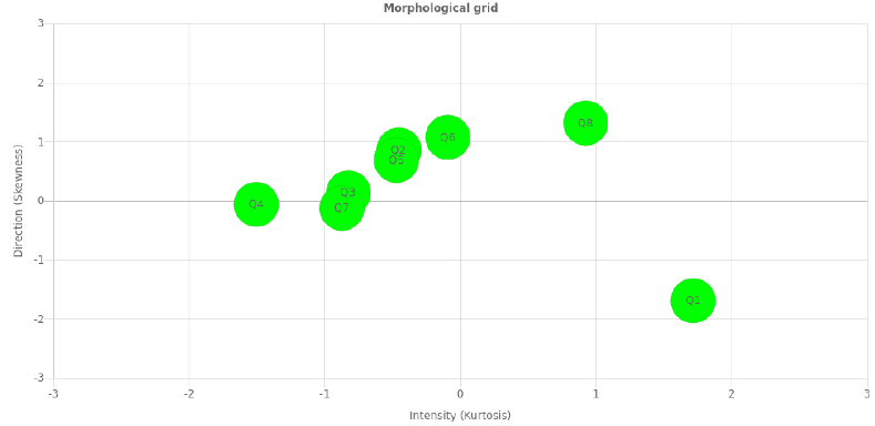
Skewness measures symmetry. Consider, for instance, the Likert’s scale “Very fun, Fun, Neither … nor, Boring, Very boring”. Negative skewness is calculated when responses tend towards “Boring” answers. Positive skewness is returned when responses are more frequently “Fun” answers.
Kurtosis measures frequency. Large kurtosis values are from questions with one or more answer classes peaking while collecting fewer answers for extreme codes, both large and small. Small kurtosis values indicate a flat distribution of answers (no peaks) while more answers are assigned to extreme codes, both large and small.
The bubble size represents the number of answer classes of one question.
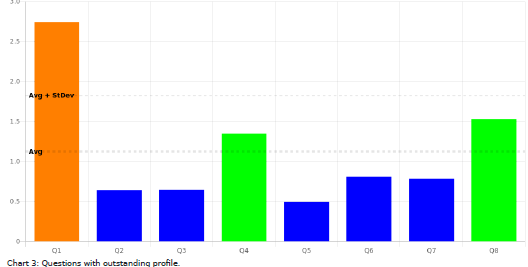
Those bubbles lying at the edges of the grid suggest to verify that the answer scale collects data appropriately. In our example, bubbles Q4, Q8 and Q1 lie at the edges of the map, and the following bar chart confirms it.
The bar chart plots on the vertical axis the distance from the centroid of skewness or kurtosis of each question. Values above average are suspect. Values above one standard deviation show evidence of an atypical distribution of the respondent answers across classes.
Read these charts together with the box-plots(helicopter view) and histograms (periscopic view) in the Excel report accompanying this PDF file.
The data does not confirm your hypotheses? There are still options to extract valuable information from your survey data. You can:
- Recode the answers to single questions, for instance, increasing or reducing the number of answer classes
- Merge two or more variables together, to form new, potentially useful variables (for instance, rounding with zero decimals the Geometric Mean of two or more answer codes from the same respondent to different questions)
- Remove one or more irrelevant variables from the analysis
7.5.4.Outliers
LogRatio searches for outliers among questions and respondents, because outliers can impair the correct interpretation of survey data and, in some cases, it may be advisable to remove them.
When an outlier is detected LogRatio makes a comment in the PDF report.
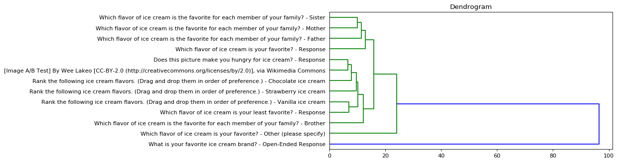
Outliers are detected when the Euclidean Distance measured to fuse a variable (question) or a respondent with a cluster lies above the threshold. The threshold is equal to the median value of all Euclidean distances plus two standard deviations.
Outliers are also visible on the dendrogram chart of the cluster analysis. In the following image, for instance, variable “What is your favorite ice cream brand? – Open-Ended Response” is an outlier.
7.5.5.Excel Sheet: Descriptive Statistics
There are four sections in the Descriptive Statistics sheet of the LogRatio Excel report: Descriptive statistics, Box plots, Answer code distribution, and Histograms.
Try LogRatioFully automated survey reports
Descriptive statistics
This table supplies several statistics concerning closed-ended questions. These values describe and help in understanding the distribution of respondent answers across the answer options of each question of a survey.
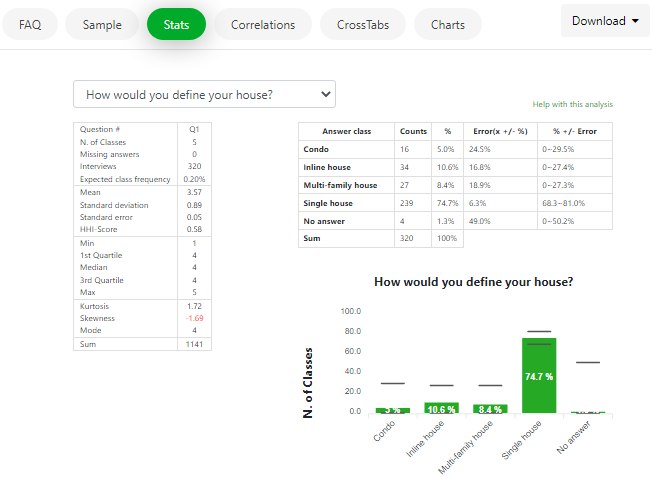
For instance, in the image that follows the values in range B8:B26 refer to question “How would you define your house?” These values were computed using the raw data in the range B17:B336 of sheet Main_DB.
Question #. The short form of the question text. This helps to keep certain charts and reports more readable.
N. of Classes. The number of answer options built in the scale used to collect respondent answers.
Missing answers. The number of interviews missing an answer to a specific question.
Interviews. The numbers of collected answers by question.
Expected class frequency. The expected value for each class of the answer scale of a question. It is equal to 1 divided by the number of classes.
Mean. The arithmetic average of the answer class numbers of a question, as coded in sheet Main_DB of LogRatio Excel report.
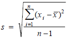
Standard deviation. This measures the average distance between a respondent answer and its mean value. It corresponds to the function STDEV.S in Excel, as opposed to STDEV.P, which returns a biased value when dealing with a sample extracted from a population, as in the case of surveys. Using n-1 in the denominator instead of n corrects for this bias. The standard deviation is influenced by outliers, and it is recommended to look for outliers in your data also using the charts in section Histograms.
Standard error. This is the standard deviation of its sampling distribution. The sampling distribution of a mean is generated by repeated sampling from the same population. For instance, 3.57 is the mean of all answer codes to question 1 of the image above. If we ask this same question, say, to 500 different samples from the same population, chances are we will get 500 different mean values. Sorting these mean values into intervals results in frequencies that represent the sampling distribution of the mean.
![]()
A common use of the standard error in surveys is to find confidence intervals. For instance, 3.57 ± (1.96 * 0.0494) returns 95% confidence limits ranging from 3.47 to 3.66. There is a 95% probability the true mean of the population this sample comes from falls in this interval.
HHI-Score. LogRatio adapted The Herfindahl index (also known as Herfindahl–Hirschman Index, HHI, or HHI-score) to measure the size of an answer class of a question in relation to all other classes.

We call it Index of Concentration and it supplies a quick idea of how skewed the distribution of respondent answers is. The closer HHI is to zero, the more normal (less skewed) the distribution of answer codes. The closer to 1, the more skewed the distribution of answer codes. The box-plots can confirm the interpretation of the HHI.
Min. The lowest answer code of an answer scale of a question used by the respondents. When dealing with coded answers to a survey it typically equals 1.
1st Quartile. Also called the 25th percentile or lower quartile, it equals the median value of the lower half of the answer codes to a question.
Median. The value in the middle of all answer codes to a question sorted in an ascendant or descendant fashion.
3rd Quartile. Also called the 75th percentile or upper quartile, it equals the median value of the upper half of the answer codes to a question.
Max. The largest answer code of an answer scale of a question.
Kurtosis. This describes the shape of a probability distribution in terms of tailedness, that is, the more outliers or extreme values in the data the larger the kurtosis. Larger kurtosis indicates a more serious outlier problem. For instance, the first chart of the image in section Histograms shows high peakedness on answer code 4 and its kurtosis, 1.72, is the largest among answers of this survey.
Skewness. This is a measure of the asymmetry of the distribution of respondent answers to a question. Negative skewness commonly indicates that the tail is on the left side of the distribution, and positive skewness indicates that the tail is on the right. Confirm this by comparing the first and the last charts of the image in section Histograms.
Mode. This is the most frequently chosen answer option to a question. For instance, the mode of question 1 in the image above is 4 because the fourth answer code to this question was preferred most often by respondents, in 74.7% of all answers.
Sum. The sum of all answer codes to a question. Divided by the number of interviews, it returns the mean value.
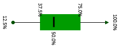
Box-Plots
A box-plot summarizes the central tendency, symmetry, skewness and outliers, if any, of a data series, for instance, like those of survey respondents in sheet Main_DB. LogRatio produces two box-plots for each closed question:
- Rescaled, in %
- Not rescaled, using the codes as in the frame code of sheet Main_DB.
We call this the Helicopter view, because looking at a boxplot is like looking at the distribution of respondent answers from above.
Similarly, the Histograms provide the Periscopic view, which is from the side. Read about histograms and compare the two views in light of what is written in this paragraph.
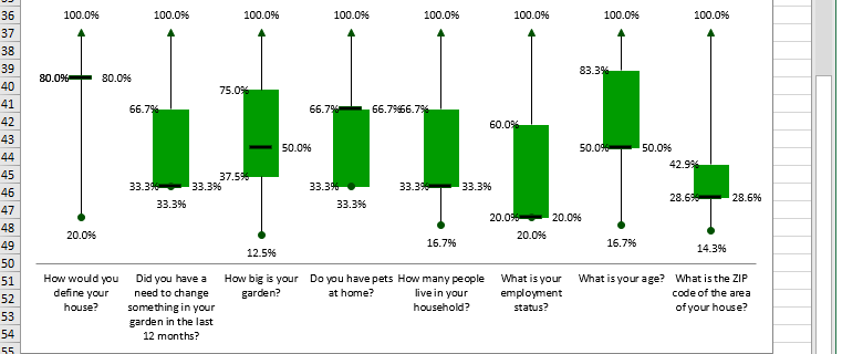
The boxplot visualizes the shape of the distribution of the answer codes to a question.
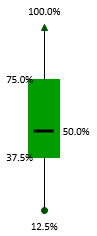
The green box in the middle accounts for 50% of the values. The ends correspond to Q1 and Q3. The dash inside the box marks the median.
The lines extending in either direction away from the box are called whiskers and mark the smallest and largest value of the distribution of answer codes of a question.
For the sake of explanation, let’s rotate the boxplot above 90 degrees to the right. Now we see the answers to this question are slightly left-skewed. This means, the distance from the median to the largest value is slightly greater than the distance from the smallest value to the median.
The histogram that follows demonstrates the relationship between the boxplot and the density curve for this particular question.
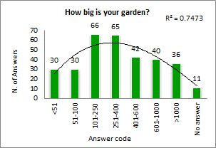
Answer Code Distribution
This section shows the marginal tables of each closed question.
For instance, range B83:B87 shows the number of respondents who chose each answer option to question “How would you define your house?”
Range B94:B98 shows the number of respondent answers in percentage relative to the 320 respondents to this question.
Marginal tables are rather basic output that researchers use to get a preliminary idea of the characteristics of a sample. They show, for a question, nothing other than the sum of respondent answers by class.
Most online survey providers show these values on a bar chart as their standard survey report. This is clearly not enough to conduct a professional analysis of a survey.
Spread the word about LogRatio. We advocate the correct use of survey insight as a way to enhance the quality of today’s decision-makers.
Histograms
Histograms visualize the distribution of the respondent answers to a question, that is, the distribution of respondent preferences. They show symmetry, skewness and outliers related to data series like those in sheet Main_DB.
We call this the Periscopic view, because looking at a histogram is like looking at the distribution of respondent answers from the side.
Similarly, Box-plots provide the Helicopter view, which is from above. Read more about box-plots and compare the two in light of what is written in this paragraph.
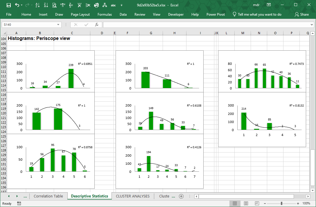
To each histogram LogRatio adds a trendline, and its coefficient of determination (R squared), to visualize the shape of the distribution of answers, which may be useful, for instance, when creating a simulation model. In this case, the coefficient of determination measures how accurately the trendline fits the distribution by class of respondent answers to a question.
In general, variables able to collect (roughly) the same number of responses in each answer class are useful to test concepts and products in comparison. While variables with skewed or peaking distributions tend to be useful for estimation and projection (inference) purposes.
Try LogRatioFully automated survey reports
7.5.6.Keywords: Descriptive Statistics
Answer scale
Answer scales are instruments provided to respondents to express an answer to a closed-ended question. There are many different ways to create scales, from Likert to semantic differential, to ranks, ratings, and more. In general, answer scales are made of response categories, and the wording and number of categories can influence responses. For this reason, some experts recommend using validated scales. Bruner (2019) is a useful source for validated scales.
Centroid
See Cluster analysis.
Chi squared (χ2)
See Cross tables.
Coefficient of determination
Also known as R squared, the coefficient of determination shown on LogRatio’s histograms measures the portion of the dependent variable that is predicted by the independent variables. It is a measure of fit of the trendline to the original data that varies between zero and one. The larger R squared, the better the fit..
Confidence intervals
Confidence intervals estimate the interval inside which lies the true value of a parameter measured with a sample.
Confidence intervals are created according to a given confidence level, hence the probability of occurrence of the measured parameter.
LogRatio uses the 95% confidence level to construct confidence intervals as follows:
![]()
Where:
- x = Estimated parameter (like a percentage of a cross table)
- Z = Z-score, equal to the number of standard deviations around the parameter, in this case 95% equals a standard score of 1.96.
- p = Hypothesis of the research as entered by the user in field “Population proportion” of the LogRatio form, 0.5 by default
- n = Sample size
Say 54.7% of 320 respondents do not have pets at home. The error level is 5.5%. The confidence interval inside which the true value lies turns out to be 54.7% ±5.5%, or any value in the range 49.2% – 60.2%.
Confidence intervals help in reading the values of survey studies correctly.
The statistical significance can be seen when constructing the confidence interval of the two values. At the 95% confidence level, the confidence intervals are constructed as follows:
Distribution
See Box-plots.
Euclidean Distance
See Cluster analysis.
Exploratory Data Analysis (EDA)
The primary aim of Exploratory data analysis (EDA) is to examine the data for distribution, outliers and anomalies in order to make and test hypotheses. LogRatio applies EDA to assess the quality of the data without making any a priori assumptions.
Herfindahl index (HHI)
The Herfindahl index (also known as Herfindahl–Hirschman Index, HHI, or HHI-score) is a measure of the size of firms in relation to the industry, and is an indicator of the amount of competition among them. It can range from 0 to 1.0, moving from a huge number of small firms to a single monopolistic producer.
LogRatio adapted HHI to measure the size of an answer class of a question in relation to all other classes of the same question. We call it Index of Concentration.
Likert’s scale
The Likert’s scale is a popular instrument to collect respondent answers to closed-ended questions. It is typically made of 5 or 7 answer classes, although other combinations are also common. The usual 5-point Likert’s scale has a neutral mid-point and two specular extremities. For instance, to ask for the level of agreement with a statement, the following Likert’s scale could be used: “Strongly agree”, “Agree”, “Neither agree nor disagree”, “Disagree”, “Completely disagree”.
See Bruner (2019) for a deeper understanding of answer scales.
Index of Concentration
See Herfindahl index.
Marginal tables
A marginal table, aka marginal tabulation, shows how frequently each answer option of a single question was selected by respondents. They are simply the Sum columns of the cross tables LogRatio makes.
Outlier
LogRatio defines outliers as items of a series lying outside the two standard deviations from the mean. In cases of heavily skewed series, LogRatio may replace the mean with the median value.
Rank-ordered answer scales
LogRatio recognizes two main categories of scales of measurement: Nominal and Ordinal. Nominal scales cannot be ordered by magnitude, for instance: Male, Female, Other gender. On the other hand, ordinal scales can be ordered, for instance: Likely, Neither likely nor unlikely, Unlikely.
Answer scales that can be ordered allow creating indexes and measuring distances between items of the same scale, which is a desirable feature, for instance, when measuring satisfaction using a Customer Satisfaction Index.
There are two more official scales: Interval and Ratio. In LogRatio terms, the Interval scale is part of the Ordinal one, with the difference that the intervals of the former scale are equally spaced.
Simulation model
Simulation models imitate real-life uncertain behaviors, for instance the sales uptake of a new brand. Repeating the model a large number of times, each time changing input parameters, and summarizing appropriately the results of the simulation, produces information useful for reducing the uncertainty or risk associated with the model.
Standard deviation
The standard deviation (sigma, σ) is a measure of dispersion around the mean of a series of numerical data. It is widely used in marketing research, and in the field of analytics in general, to create confidence intervals, thresholds, limits, and the like.
Understanding how the standard deviation works is a necessary requirement to the correct understanding of any advanced analytic technique.
Trendline
The Histograms LogRatio creates in the Descriptive Statistics sheet of the Excel report come with a trendline whose function is that of visualizing the overall shape of the distribution of the respondent answers.
Excel does a great job at adding trendlines to charts. LogRatio adds a polynomial trendline of order three, which means that it uses the time (1, 2, 3, …, n), the time squared, and the time raised to the third power as the independent variables on which to regress the dependent series and estimate the trendline function.
The value R squared, aka coefficient of determination, shown on LogRatio’s histograms measures the portion of the dependent variable that is predicted by the independent variables. It is a measure of fit of the trendline to the original data that varies between zero and one. The larger R squared, the better the fit.
7.5.7.Literature to chapter Descriptive Statistics
Bruner, Gordon C. II (2019). Marketing Scales Handbook, Volume 10. GCBII Productions, LLC.
Berenson, Mark L., et al. (2019). Basic business statistics: concepts and applications. Pearson Education, Inc.
Engineering Statistics eHandbook. NIST/SEMATECH, http://www.itl.nist.gov/div898/handbook/, 05.03.2020. U.S. Department of Commerce.
Herfindahl index: Wikipedia, https://en.wikipedia.org/wiki/Herfindahl%E2%80%93Hirschman_Index. Enquired October 6, 2021.
Komorowski, Matthieu, Dominic C. Marshall, Justin D. Salciccioli, Yves Crutain (2000). Exploratory Data Analysis. MIT DOI 10.1007/978-3-319-43742-2_15.
Munshi, Jamal (April 2014). A Method for Constructing Likert Scales. SSRN Electronic Journal DOI:10.2139/ssrn.2419366
Saris, Willelm E., Irmtraud N. Gallhofer (2014). Design, Evaluation, and Analysis of Questionnaires for Survey Research. John Wiley & Sons, Inc
Stevens, S. S. (1946). On the Theory of Scales of Measurement. Science, New Series, Vol. 103, No. 2684 (Jun. 7, 1946), pp. 677-680 (4 pages)
Tukey, John W. (1977). Exploratory Data Analysis. Addison-Wesley Publishing Company.
7.6.CLUSTER ANALYSIS
Are you looking for groups of like-minded respondents? Try Cluster analysis. It is used to segment items or people in homogeneous groups.
LogRatio applies the Ward’s clustering method. It belongs to the Hierarchical methods, and it is particularly effective in the case of automated analysis because it does not require specifying in advance the desired number of clusters to find in the data.
Anderberg (1973) wrote: The value of exploratory cluster analysis is primarily in the tendency for new arrangements of data units or variables to suggest relationships and principles previously unnoticed. The substantive results are not the output of the computer but the new ideas prompted in the analyst’s mind.
In order to prompt new ideas in the reader’s mind, LogRatio performs two different cluster analyses with the closed-ended variables in sheet Main_DB: by column and by row.
The results of the cluster analysis by row (respondents) are coded and placed at the right-side end of sheet Main_DB. These codes are used to make the cross tables useful to understand and describe each group of respondents belonging to a homogeneous cluster.
Try LogRatioFully automated survey reports
7.6.1.Excel Sheets: Cluster Analysis
There are several sheets under the Cluster Analysis section of the LogRatio Excel report.
In the following two sheets, LogRatio prints a bar-chart and a dendrogram as an aid to visualize the partition of items in groups:
- Cluster Analysis – Columns.
- Cluster Analysis – Rows.
In the next sheets, three in this case, there are contingency tables, aka cross tables or crosstabs, that describe the different levels of cluster configurations LogRatio found:
- CrossTab – Clusters – C1 (all respondents are split in two groups).
- CrossTab – Clusters – C2 (all respondents are split in more than two groups, often four).
- CrossTab – Clusters – C3 (all respondents are split in more groups than in C2, often eight).
To identify and describe the groups of a segmentation study is more of an art than a scientific practice. The experience, expertise, and intuition of the analyst play a primary role in this phase. We show later how to take full advantage of the visual inspection tools produced by LogRatio.
Sheet: Cluster Analysis – Columns
This sheet shows the results of a cluster analysis (Ward’s algorithm) conducted on the columns of the closed questions in sheet Main_DB.
The table on the left side of the image below shows the different fusion levels the algorithm found to produce the final cluster configuration.
The Euclidean distances are plotted on the histogram chart.
The dendrogram is a valid and intuitive tool to grasp at a glance the data structure. On the horizontal axis, the sooner two variables group together the more homogeneous their group.
There are two major groups in this example: Red clamps and Green clamps. These two groups are homogeneous and well separated.
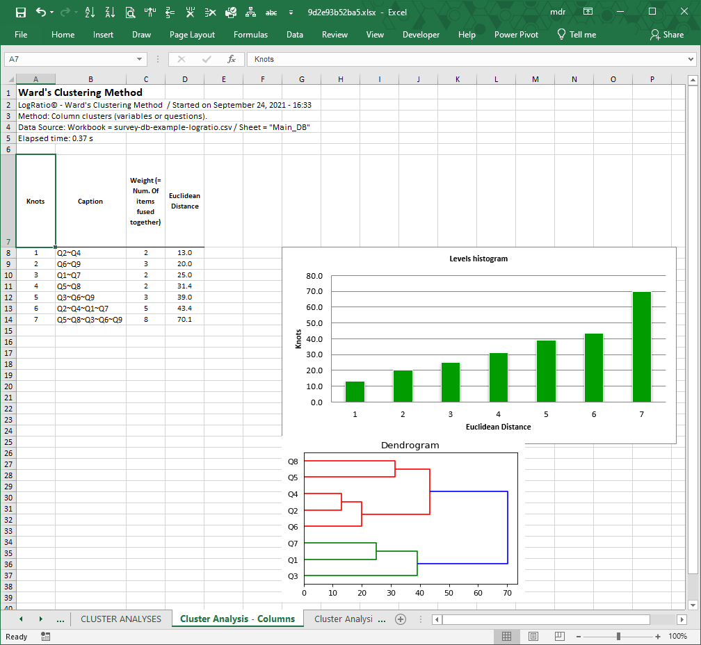
An analyst expert in the process being measured with this survey could extract useful information from the interpretation of the composition of each cluster.
In the case of the dendrogram in the image above, the red clamps form two distinct sub-groups:
- Q8 (living area) and Q5 (household size)
- Q4 (pets), Q2 (needs in garden) and Q6 (employment status)
Sheet: Cluster Analysis – Rows
This sheet shows the results of a cluster analysis (Ward’s algorithm) conducted on the rows of the closed questions in sheet Main_DB.
The table on the left side of the sheet shows the different fusion levels the algorithm found to produce the final cluster configuration.
The largest Euclidean distances are plotted on the histogram chart.
The dendrogram plot shows the configuration of clusters. There are two major groups: Red clamps and Green clamps. In this case, due to the large number of rows (respondents) it is apparent that sub-clusters exist in each major group. The red one, for instance, shows three large sub-groups, each showing sub-groups at different fusion levels.
Analysts expert in the process being measured with this survey could extract useful information from the interpretation of the composition of each cluster.
To favor the interpretation of this cluster analysis by row, LogRatio produces three sheets of cross tables that segment the survey data, in this example, according to two, four, and eight homogeneous groups of respondents.
The black shapes were added to the dendrogram on this page for the sake of explaining the concept of two (black circle), four (square) and eight (triangle) homogeneous groups.
The items, survey respondents in this case, belonging to a group can be precisely identified. For instance, the first group from the bottom marked with a black triangle, cluster 1, is made of 12 respondents. The last three respondents are labeled 65, 57 and 137. To see who they are, go to sheet Main_DB, respondent number 65 (row 81) is 65+ years old, lives in a “Single house” with a big garden (>1000), and so on.
The detailed analysis of the clusters of this example is in the sheets “CrossTab – Clusters – C_[n]”, where each partition is cross-tabulated against all closed-ended questions.
Cross tables are one of the most effective tools to slice down large datasets of respondent answers. We encourage LogRatio users to deepen their understanding of how to use cross tables. Read also How to read cross tables.
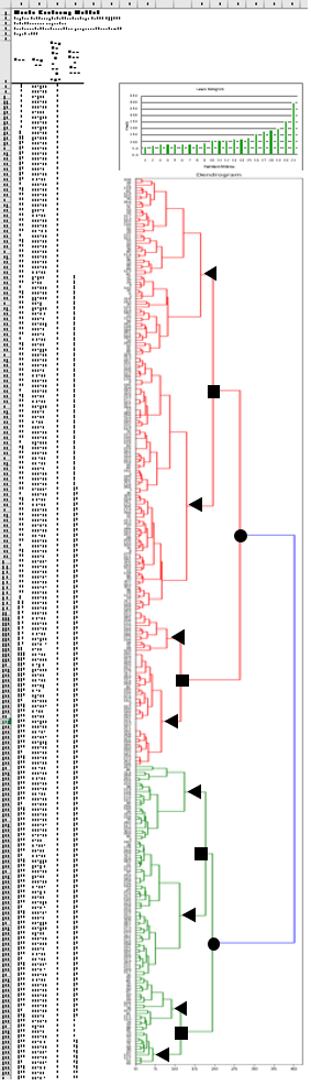
Sheets: CrossTab – Clusters – C1 / C2 / C3
Each of the three sheets called “CrossTab – Clusters –” show the responses to each closed question in this survey crossed by a given number of clusters. Sheet C1 uses two clusters. Sheet C2 and C3 use four and eight clusters, respectively.
The following image refers to “CrossTab – Clusters – C2”. Each answer option of a question is represented in a column of the crosstab, the clusters are represented by row.
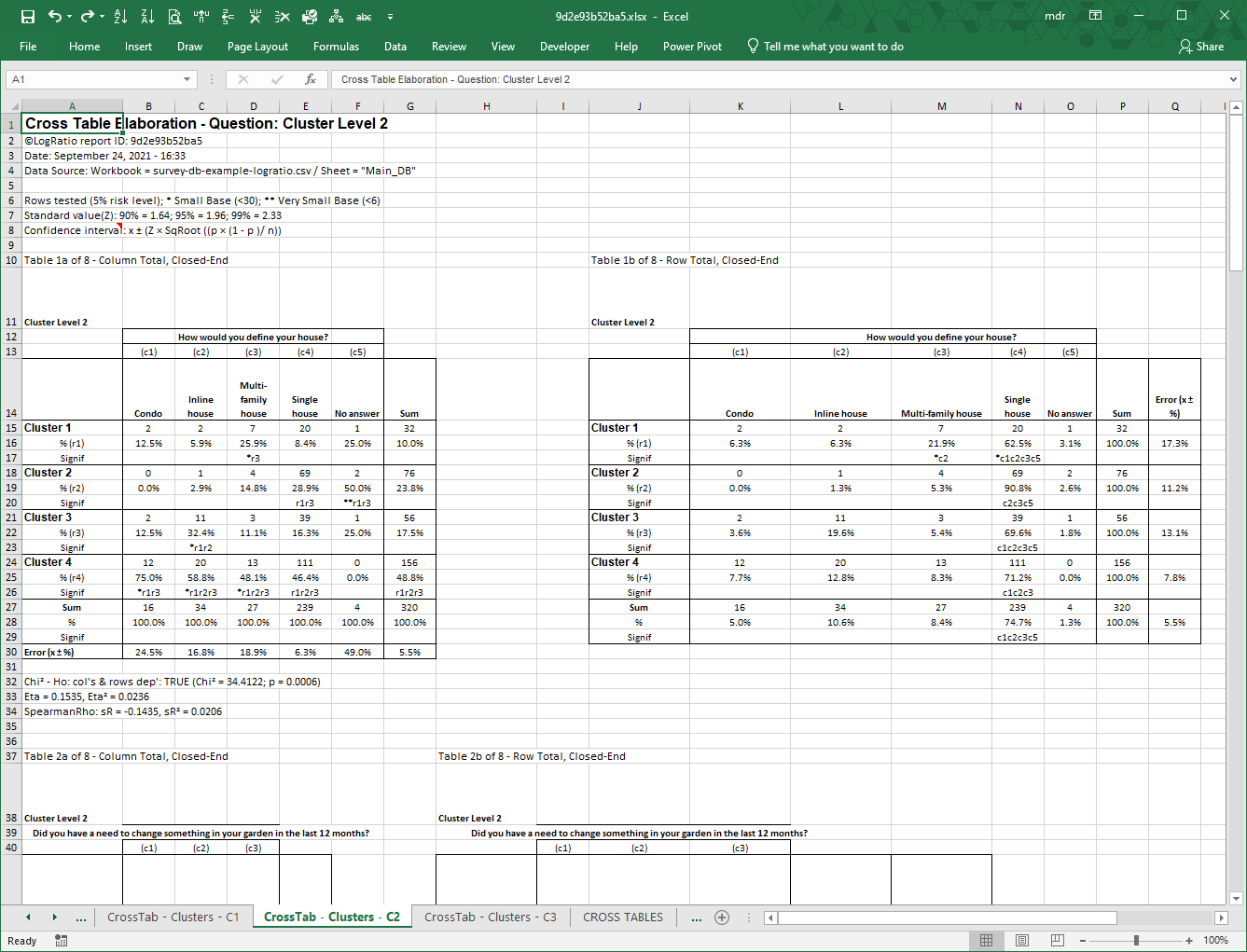
Note: Cross tables assign cluster numbers beginning from the bottom side of the dendrogram.
Each question has two tables: A and B. Table A, on the left, computes column percentages, so the sum of column percentages adds to 100%.
Table B does the same by row. This way you have the same picture taken from two different perspectives, supplying different findings.
The last row of table A and the last column of table B show the error level associated with each direction of the two tables. This is an important element to interpret appropriately the values in a table.
The rows called “Signif” show the result of a significance test conducted on the proportions at the 95% probability level. In cell D17 (table A), for instance, the string “*r3” means that 25.9% is significantly larger than the 11.1% in cell D22 (row 3). The asterisk indicates a small number of respondents (see cell A6 for the asterisk legend).
Table A shows that Cluster 1 is characterized by a large share of “Multi-family house”; Cluster 2 has a large share of “Single house”; Cluster 3 has a large share of both “Inline house” and Single house”, while Cluster 4 has a substantial share of every house type. These clusters of respondents may suggest interesting ideas and activities to the person using the results of this survey.
Read these tables together with the dendrogram.
7.6.2.PDF report Cluster Analysis
The PDF report includes a compact reading of the results of the Cluster Analysis by survey respondent (see Sheet: Cluster Analysis – Rows).
Each cluster is described using a spider chart and a few comments on the variables that characterize it.
To make sense of each cluster, LogRatio distinguishes between Characterizing, Relevant, Marginal and Rare variables.
- Variables are judged Characterizing if chosen by 85% or more of the respondents associated with one cluster. On the chart they have a green, bold label.
- Relevant variables were chosen by less than 85% and more than 60% of the respondents of a cluster. On the cluster chart they are shown with a green non-bold label.
- Marginal variables were preferred by less than 60% of the respondents of a cluster. They have a grey label on the cluster chart.
- Finally, Rare variables have the peculiarity of having one answer option associated with one cluster only. Being so rare, these variables are mentioned even if they collected the preference of only 35% of the respondents of that group. They are shown on the chart with a black label.
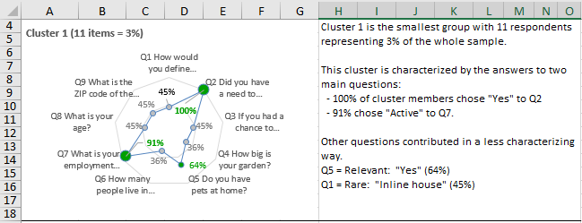
The example in the image above shows the typical reporting format.
In this case, Cluster 1 is made of 11 respondents, or 3% of the whole sample, sharing common characteristics concerning two main variables (questions): Q2 and Q7.
From the green, non-bold label we understand Q5 is a Relevant variable, yet not characterizing.
And the black label suggests Q1 is a Rare variable.
For the sake of cluster description, we could say this a small group of employed people with a need about their garden. Two thirds of them have a pet and one half live in an inline house. Readers knowledgeable of the survey background could be able to find a cluster label made of one to two descriptive words that gives a distinctive sense of this group.
For space convenience, the text labels on the chart are kept short. The full text can be found in sheet “CrossTab – Clusters – C3”.
7.6.3.Keywords: Cluster Analysis
Centroid
The centroid corresponds to the group mean of a cluster. The items clustered in a group are said to be homogeneous because their distance from the centroid is minimized with respect to the other groups found with the same cluster analysis.
Marketers are interested in dividing customers into homogeneous groups because it is easier to reach and communicate with a group of people sharing some fundamental characteristics.
Cluster
A cluster is a homogeneous group of items from the same set that are well separated from other groups. There is a considerable number of different approaches to clustering data. Myers distinguishes between two basic conceptual frameworks for segmentation:
- Customer-based versus Product/Service-based segmentation. These are dependence techniques, which use one or more independent variables to explain and predict a dependent variable. Among the most common dependence techniques are AID, CHAID, regression, and discriminant analysis.
- A priori versus Post hoc (a posteriori) segmentation. These are independence techniques, which are typically used for grouping people or items similar in terms of one or more describing variables. Among the most common independence techniques are hierarchical clustering, partition clustering, and other multivariate analysis methods such as factor analysis, correspondence analysis, and principal components analysis.
LogRatio applies the Ward’s clustering algorithm, a hierarchical methodology that has the advantage of not requiring the analyst to decide in advance how many clusters to find in the data and, therefore, can be completely automated, which is aligned with the mission LogRatio is on: Simplify.
Dendrogram
Dendrograms are tree-like structures LogRatio uses to visualize when and how the various pairs of items of a survey have merged during a cluster analysis. The horizontal axis refers to the Euclidean distance when two items merged. The shorter this distance, the more similar the two items.
Error level
See section Sample Size Analysis.
Euclidean distance
To find homogeneous groups in a dataset, LogRatio applies the furthest neighbor, squared Euclidean distance method, perhaps the most commonly used distance measure. The formula is:
The Euclidean distance can be interpreted as physical distance between two items.
Hierarchical methods
See Cluster.
Homogeneous groups
See Cluster.
Level histogram
The Level histogram, aka scree-plot, helps in determining the number of segments of a cluster analysis. It is a plot of the within-cluster heterogeneity on the vertical axis and the number of segments on the horizontal axis. Hierarchical cluster analysis groups respondents together until only one cluster is left, the last bar on the right side of the histogram.
There is no formal rule for interpreting this chart. Starting from the right, it is typical to take the number of clusters that have a sharper cut from the remainder, excluding the last, largest group, which groups together all items.
Proportions
Proportions, aka percentages, are labeled with “%” in the cross tables made by LogRatio. There are two kinds: row percentage and column percentage tables, shown as cross table A (left side of the sheet) and cross table B (right side), respectively. Percentages are obtained by dividing the counts by the Sum of counts of a table. The sum of percentages of one direction, A or B, adds to 100%.
Proportions can be interpreted as probabilities.
Standardization
This means preliminary processing data so that each column vector (like all respondent answers to one closed-ended question) has a mean value equal to zero and a standard deviation equal to one. This way, any effect due to the size of one variable against another is removed and the clustering algorithm returns more reliable classifications.
The complete standardization of the single values of a vector is obtained with the formula:
![]()
Ward’s algorithm
Ward’s is a hierarchical partitioning method that applies a recursive algorithm to minimize the total within-cluster variance and find the pair of items that, after merging, leads to a minimum increase in total within-cluster variance.
The Ward’s clustering method is particularly effective in the case of automated analysis because it does not require specifying in advance the desired number of clusters to be found in the data.
7.6.4.Literature to chapter Cluster Analysis
Anderberg, Michael R. (1973). Cluster Analysis for Applications. Academic Press.
Everitt, Brian S. (1993). Cluster Analysis. Edward Arnolds.
Myers, James H. (1996). Segmentation and Positioning for Strategic Marketing Decisions. American Marketing Association.
Punj, Girish and Stewart, David W. (1983). Cluster Analysis in Marketing Research: Review and Suggestions for Applications. Journal of Marketing Research. 20 (May), 134-149, 1983.
7.7.CROSS TABLES
An old saying goes “You cannot swallow an elephant but you can eat it slice by slice”.
Contingency tables are the tool to slice the market research elephant.
There is a reason why contingency tables, aka cross tables or crosstabs, are perhaps the most used tool by professional survey analysts: Crosstables dig deep into survey data in a systematic way, to turn data into information that can ignite the capacity of generating useful insights.
Try LogRatioSurvey reports as they should be
Cross Tables report organization
In the CROSS TABLES section of the LogRatio Excel report there are as many sheets as questions in the survey.
In each sheet, the main question (dependent variable) is cross-tabulated by all other questions (independent variables) of the survey.
The report sheets are divided into two groups because LogRatio makes a distinction between closed- and open-ended questions:
- CrossTab – Closed-ended – Q[number]. In each of these sheets, the dependent question is a closed-ended question cross-tabulated by all other closed-ended questions of the survey
- CrossTab – Open-Ended – Q[number]. In each of these sheets, the dependent question is an open-ended question cross-tabulated by all other closed-ended questions of the survey (as of January 2020, LogRatio does not treat open questions. The functionality will be restored as soon as possible).
In each sheet, each pair of crossed questions produces two tables (as in the following image, where “Do you have pets at home?” is the dependent variable):
- Cross Table A, on the left, shows percentages (aka proportions) by column. The sum of the percentages of a column adds to 100%.
- Cross Table B, on the right, shows percentages by row. The sum of the percentages of a row adds to 100%.
Although the counts do not change, the two tables supply different percentage values, different significance test results, and different error levels. The same picture, taken from two different perspectives, supplying different information, gives the opportunity for expert analysts to uncover hidden relationships not always apparent using only one of the two tables.
Using cross tables correctly, however, requires experience, and there are some topics to pay attention to.
Continue reading this help chapter to learn how to read and use survey reports created with LogRatio.
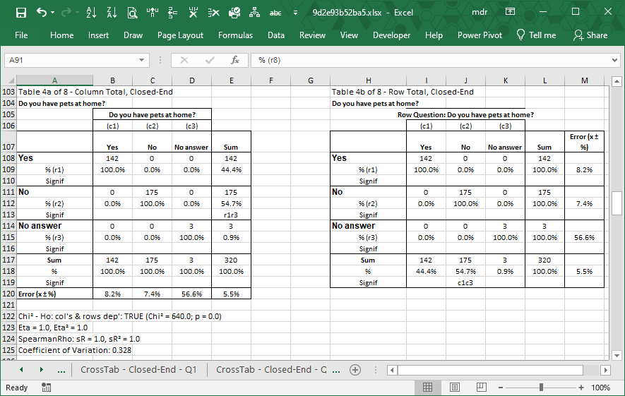
Image 1: LogRatio crosstable A and B
7.7.1.How to read cross tables
Contingency tables are also called cross tables or crosstabs because they actually present the crossed counts of two or more variables.
Anatomy of a cross table
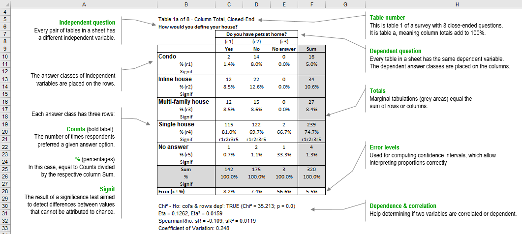
Image 2: How to read crosstabs
The cross tables LogRatio makes are also called two-way tables because they are made with the crossed answer classes of two questions: one as the column and the other as the row.
In LogRatio’s tables each answer class has three rows of information called: Counts (bold label), % (percentages), and Signif. The totals (Sum), also called Marginal tabulation, follow the same rule with three rows. The error levels complete the picture.
The text that follows explains each element of LogRatio’s cross tables in detail.
Counts
This is the number of times respondents preferred a given answer option to a survey question. For instance, in our example, out of 320 answers, 239 respondents answered question “How would you define your house” with “Single house”; of these, 115 respondents have pets at home, 122 don’t, and 2 did not answer this question.
Percentages
Counts are converted to percentages, to help the analyst in figuring out the proportions between sub-groups of respondents. Proportions, or percentages, are important because they can lead to identifying groups or clusters of respondents with common characteristics, they help in prioritizing, and, very important, percentages enable testing the significance of their differences.
In our example, 74.7% (or 239) of the 320 respondents answered “Single house” to question “How would you define your house”. 81.0% (or 115) of the 142 respondents with pets at home also answered “Single house”.
The percentages of table A are made from column totals, while in table B (see image 1 in the previous section) the percentages are computed on row totals. These two views are able to uncover a lot of information.
Significance test
Testing the significance of the difference of two proportions makes sure the proportions are not just the result of variation by chance.
LogRatio uses the Z-test at the 95% confidence level to compare the significance of the differences between proportions of crosstabs, and when it finds a significant difference, LogRatio adds a string on the relevant row Signif.
For instance, cell C21 in the image above shows “r1r2r3r5”, which means: 81% is a value statistically larger (not due to chance) than the other proportions in row 1, 2, 3, and 5 of answer class c1 (see row 8 of image 2). These are: 1.4% (r1 = row 1 of the table), 8.5% (r2 and r3 = row 2 and 3 of the table), and 0.7% (r5 = row 5 of the table).
The table above has column totals. Tables with row totals replace the r with a c, for column, and are read horizontally instead of vertically as in this example (see table B of image 1 in the previous section).
Error levels
Error levels are perhaps the most critical elements to interpret correctly the data of a cross table.
In the Sample size section of its report LogRatio computes the overall error level of the survey, 5.5% in our example (repeated in cell F28 of the table above). This means, for instance, that the 10.6% in cell F14 should be read as “any value in the interval 10.6% ±5.5%”, that is any value between 5.1% and 16.1%. This overall error value is found using the whole sample size (320 respondents in our example), therefore it applies only to the total (Sum) proportions of a table, both row and column totals.
Reading a proportion in the white area of the table above requires computing the appropriate error level based on the relevant sample size. The proportion 8.5% of cell C14, for instance, should be read as “any value in the interval 8.5% ±8.2%” according to the sample of 142 respondents as in cell C25.
In this example, row 28 holds the error levels by column for table A. Table B holds, in its last column, the error levels by row.
Variables dependence and correlation
Under table A of each pair of tables LogRatio prints several coefficients useful for finding out whether the two variables are dependent or correlated.
Chi squared test
Dependent variables are linked by a relationship, and this relationship can be tested with a Chi2 test. The result of the independence test reads like this: “Chi2 – Ho: col’s & rows dep’: TRUE (Chi2 = 125.837; p = 0.0)”.
If the variables are independent the Chi2 test results FALSE. If they are related the test returns TRUE. The p-value supplies the confidence level of the test, where: (p less or equal to 0.05) = TRUE.
Correlated variables tend to move together. That is, high values of variable A tend to correspond to high or low values of variable B. This is not causation, we cannot say one variable causes the other, but we can still spot dynamics that can lead to concrete actions. For instance:
- Dynamic: The quantity of toothpaste used correlates to smoking habits: smokers use less.
- Action: Consider educating smokers to use more toothpaste of brand X.
LogRatio’s tables supply the Eta and the Spearman’s Rho Correlation Coefficient, both also squared, to measure the relationship that characterizes the two variables.
Eta correlation coefficient
Eta, the coefficient of nonlinear relationship, is often useful to measure a relationship irrespective of if it is linear or not. Eta suits the case of categorical variables, it is interpreted similarly to the Pearson, but can never be negative.
The Eta Correlation Coefficient is an index ranging from 0 to 1.0 and reflects the extent of a nonlinear relationship between two data sets. Eta squared tells us more about the strength of the relationship between variables, it measures the proportion of variation explained by the independent variable. In the case of the table above both values are very low (Eta = 0.1262, Eta squared = 0.0119) signifying a lack of correlation between pets at home and house kind.
Spearman’s Rho
Rho measures the strength and direction of the association between two ranked variables. It ranges from -1 to 1, where negative values show an increasing negative correlation and positive values show an increasing positive one.
In the case of the table above both values are very low (Rho = -0.109, Rho squared = 0.0119), which suggests a very low negative correlation between pets at home and house kind. In fact, only 1.19% (Rho squared) of the variation in the dependent variable pets at home can be explained with the variable house kind.
Try LogRatioSurvey reports as they should be
7.7.2.Excel Sheets: Cross Tables
Sheets: CrossTab – Closed-Ended – Q[n]
Each of these sheets in the Excel report, 8 in our example, contains one dependent variable (columns of tables) cross-tabulated by all other closed-ended questions of a survey (independent variables, rows of a table).
This fine view enables us to uncover useful details that are not always apparent at first sight.
Read also How to read cross tables to learn more about cross-tables produced by LogRatio.
Sheet: CrossTab – Open-Ended – Q[n]
LogRatio transforms open-text answers into numerical codes, and the codes into cross tables, as in the image that follows. The transformation from text to numbers requires the application of advanced algorithms of Deep Learning and of Natural Language Processing (NLP).
As of January 2020, LogRatio does not treat open questions. The functionality will be restored soon. Our solution to the automated coding of text is not perfect yet. We are still working on it and every significant improvement we make is added to the algorithm. Chances are that at the time you are reading this help material the quality of open-text coding has improved already.
Read also How to read cross tables to learn more about cross-tables produced by LogRatio.
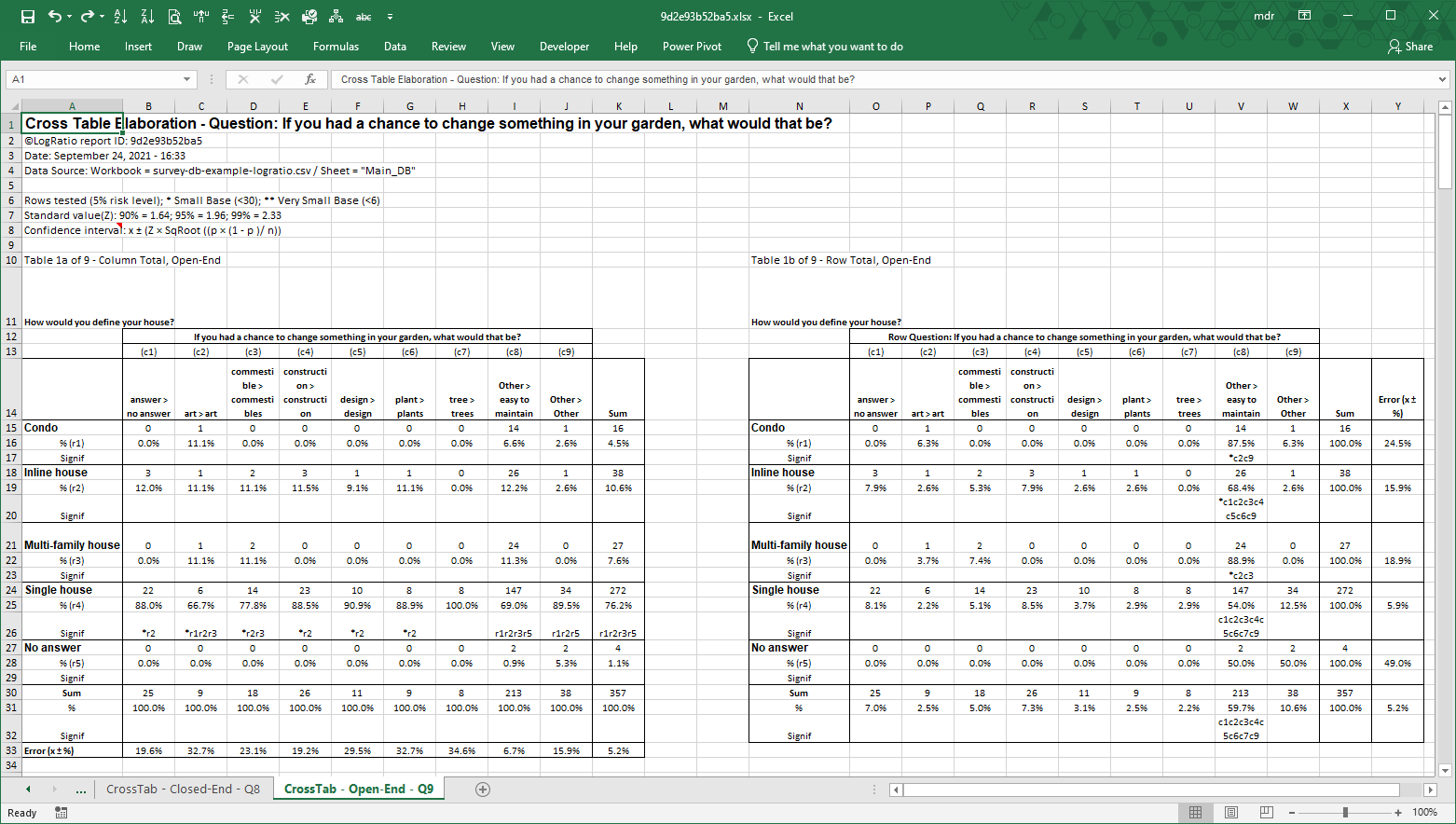
Try LogRatioFully automated survey reports
7.7.3.Keywords: Cross Tables
Answer scale
LogRatio understands an answer scale as a list of answer options offered to survey respondents to answer survey questions. This is a huge and multifaceted subject that involves aspects of linguistics, social science, statistics, and psychometrics.
Suggested readings are DeVellis (2003) and Saris (2014).
Answer types
LogRatio understands the answers respondents give to questions as one of three types: Single choice, Multiple choice, and Open text. Each type has its own advantages and limitations in relationship to the question it applies to. When used correctly, all types are useful for gathering data.
Association
In marketing research, the term “association” indicates the relationship existing between two variables, hence questions. Associations can be positive or negative, linear or non-linear. Understanding the association, aka correlation, between variables of a survey helps in interpreting the survey results correctly.
However, “association” does not imply “causation”. Two variables can be associated (or correlated) without one causing the other.
Closed-ended question
Closed-ended questions let respondents answer by choosing from a predetermined list of answer classes. Some closed questions allow a single answer, others may allow multiple answers.
Confidence interval
Confidence intervals set an upper and a lower limit as the boundaries of certainty around a sampling value. When reporting a value from a survey, it is appropriate to include its confidence interval, to give a sense of how certain or uncertain that value is. Narrow confidence intervals should be preferred.
LogRatio prints each cross table with the corresponding error levels in percent. Confidence intervals are created by adding and subtracting the error value from a proportion of a crosstab.
Dependent variable
In survey research, a variable becomes dependent when we try to understand how it is affected by other variables which are called independent. For instance, in trying to understand how shaving habits (wet or dry) change among men of different age classes, age could be the independent variable and shaving the dependent one.
Error level
See Keywords: Sample Size
Independent variable
See: Dependent variable
Marginal tabulation
This is a rather basic output of survey analysis consisting of the sum of the answers to each answer option of a question. In a cross table the marginal tabulations correspond to the sums of the single rows and columns.
Limiting the analysis of survey data to reading marginal tabulations is a mistake. Survey users should always work with cross tables, which include marginal tabulations too.
Open-ended question
Open-ended questions do not present respondents with a list of predetermined answer classes. Respondents answer in their own words. Intuitively, this approach requires some extra work to transform respondent answers into numbers that can be analyzed and interpreted.
Question types
See Open-ended question and Closed-ended question
Sampling error
See Keywords: Sample Size
Significance of the difference between proportions
Say, of 96 respondents, 47.9% said they smoke and 52.1% said they don’t. One could be tempted to state that non-smokers outnumber smokers by 4.2%, but this wouldn’t be true. In fact, we are reading the results of a survey, which implies an error level. Therefore, in order to confirm that the proportion of non-smokers is higher than that of smokers it is necessary to test the significance of the difference between the two proportions (4.2%).
The question becomes: Is the 4.2% difference between smokers and non-smokers large enough to state that the quantity of the latter is really larger than the former?
For a sample of 96 respondents surveyed at the 95% confidence level, there is a probability of 72% that the difference exists. This probability is not large enough to confirm that the two proportions differ, and the percentages must be read as two equal numbers, say 50% and 50%.
LogRatio applies the Z-Test at the 95% confidence level to verify the significance of differences.
Spike
LogRatio understands a spike as a concentration of counts exceeding the threshold in one answer class of a question. The threshold limit is set to the average of the counts to all answer classes of a question plus one or 1.5 standard deviations (sd). The one sd limit is set when all other answer classes have a number of counts smaller than the average; otherwise the 1.5 sd limit is triggered.
Spikes may have a negative effect on the results of a survey and must be treated accordingly. LogRatio makes suggestions on how to handle spikes in different situations.
Z-test
In marketing research, the z-test is commonly used to test the hypothesis that two proportions are different. To approximate a standard normal distribution, the test assumes the samples are reasonably large.
LogRatio tests the difference between all proportions of all cross tables it produces, because the significance values help in quickly locating the data driving the most substantial differences in the tables.
See also Significance of the difference between proportions
7.7.4.Literature to chapter Cross Tables
Agresti, Alan (1990). Categorical Data Analysis. Wiley.
DeVellis, Robert F. (2003). Scale Development: Theory and Applications. Sage Publications.
Everitt, B.S. (1977). The Analysis of Contingency Tables. Springer.
Green, Paul and Tull, Donald S. (1978). Research for Marketing Decisions. Prentice-Hall International.
Saris, Willem E. and Gallhofer, Irmtraud (2014). Design, evaluation, and analysis of questionnaires for survey research. John Wiley & Sons, Inc.
Tull, Donald and Del, Hawkins (1993). Marketing Research Measurement and Method. Macmillian Publishing Company.
Try LogRatioFully automated survey reports