There are five sheets under the Cluster Analysis section of the LogRatio Excel report.
In the following two sheets, LogRatio prints a bar-chart and a dendrogram as an aid to visualize the partition of items in groups:
- Cluster Analysis – Columns.
- Cluster Analysis – Rows.
In the next sheets, three in this case, there are contingency tables, aka cross tables, that describe the different levels of cluster configurations LogRatio found:
- CrossTab – Clusters – C1 (all respondents are split in two groups).
- CrossTab – Clusters – C2 (all respondents are split in more than two groups, often four).
- CrossTab – Clusters – C3 (all respondents are split in more groups than in C2, often eight).
To identify and describe the segments of a segmentation study is more of an art than a scientific practice. The experience, expertise, and intuition of the analyst play a primary role in this phase. We show later how to take full advantage of the visual inspection tools produced by Cluster Analysis.
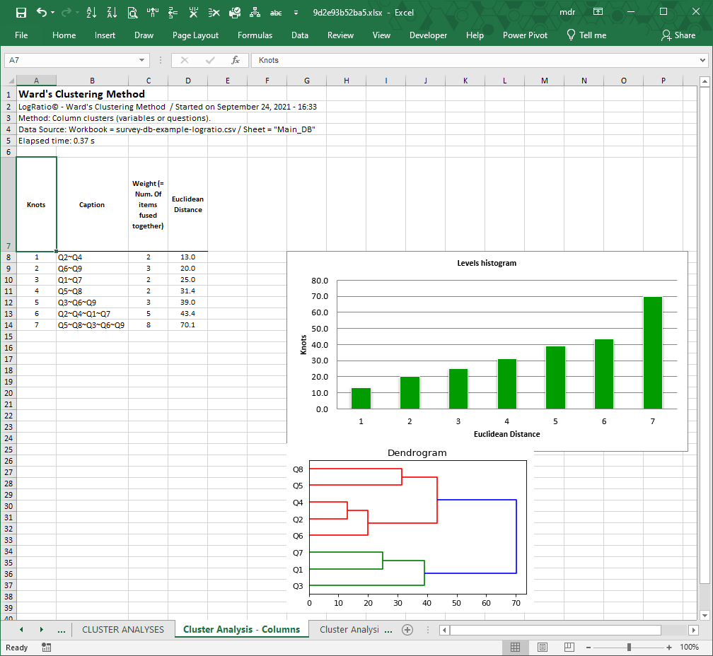
Sheet: Cluster Analysis – Columns
This sheet shows the results of a cluster analysis (Ward’s algorithm) conducted on the columns of the closed questions in sheet Main_DB.
The table on the left side of the image below shows the different fusion levels the algorithm found to produce the final cluster configuration.
The Euclidean distances are plotted on the histogram chart.
The dendrogram is a valid and intuitive tool to grasp at a glance the data structure. On the horizontal axis, the sooner two variables group together the more homogeneous their group.
There are two major groups in this example: Red clamps and Green clamps. These two groups are homogeneous and well separated.
An analyst expert in the process being measured with this survey could extract useful information from the interpretation of the composition of each cluster.
In the case of the dendrogram in the image above, the red clamps form two distinct sub-groups:
- Q8 (living area) and Q5 (household size)
- Q4 (pets), Q2 (needs in garden) and Q6 (employment status)
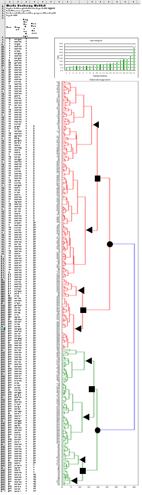
Sheet: Cluster Analysis – Rows
This sheet shows the results of a cluster analysis (Ward’s algorithm) conducted on the rows of the closed questions in sheet Main_DB.
The table on the left side of the sheet shows the different fusion levels the algorithm found to produce the final cluster configuration.
The largest Euclidean distances are plotted on the histogram chart.
The dendrogram plot shows the configuration of clusters. There are two major groups: Red clamps and Green clamps. In this case, due to the large number of rows (respondents) it is apparent that sub-clusters exist in each major group. The red one, for instance, shows three large sub-groups, each showing sub-groups at different fusion levels.
Analysts expert in the process being measured with this survey could extract useful information from the interpretation of the composition of each cluster.
To favor the interpretation of this cluster analysis by row, LogRatio produces three sheets of cross tables that segment the survey data, in this example, according to two, four, and eight homogeneous groups of respondents.
The black shapes were added to the dendrogram on this page for the sake of explaining the concept of two (black circle), four (square) and eight (triangle) homogeneous groups.
The items, survey respondents in this case, belonging to a group can be precisely identified. For instance, the first group from the bottom marked with a black triangle, cluster 1, is made of 12 respondents. The last three respondents are labeled 65, 57 and 137. To see who they are, go to sheet Main_DB, respondent number 65 (row 81) is 65+ years old, lives in a “Single house” with a big garden (>1000), and so on.
The detailed analysis of the clusters of this example is in the sheets “CrossTab – Clusters – C…”, where each partition is cross-tabulated against all closed-ended questions.
Cross tables are one of the most effective tools to slice down large datasets of respondent answers. We encourage LogRatio users to deepen their understanding of how to use cross tables. Read also How to read cross tables.
Sheets: CrossTab – Clusters – C1 / C2 / C3
Each of the three sheets called “CrossTab – Clusters –” show the responses to each closed question in this survey crossed by a given number of clusters. Sheet C1 uses two clusters. Sheet C2 and C3 use four and eight clusters, respectively.
The following image refers to “CrossTab – Clusters – C2”. Each answer option of a question is represented in a column of the crosstab, the clusters are represented by row.
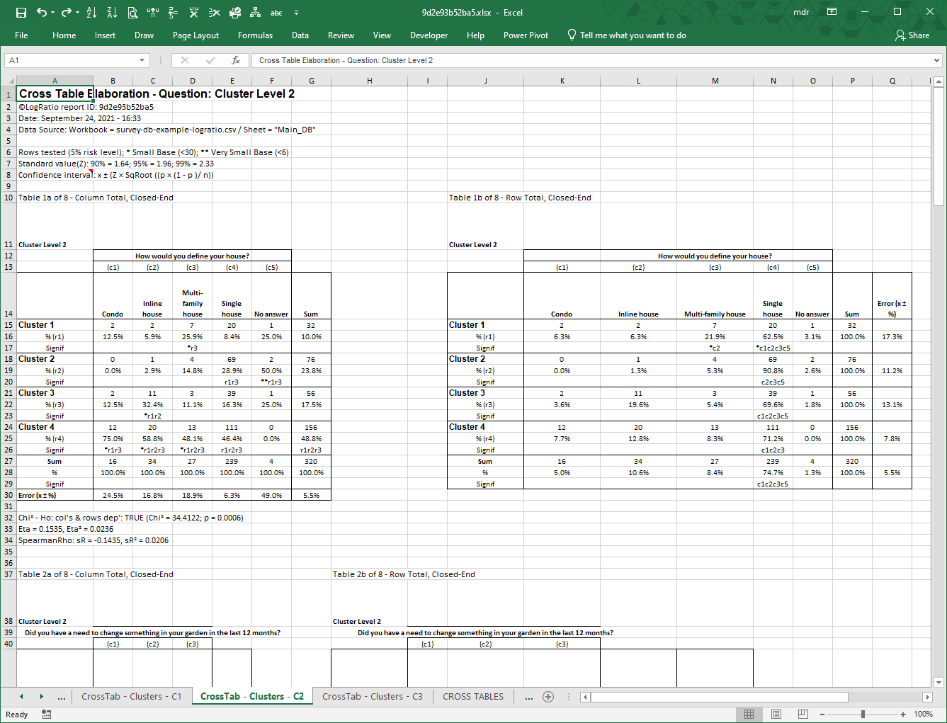
Note: Cross tables assign cluster numbers beginning from the bottom side of the dendrogram.
Each question has two tables: A and B. Table A, on the left, computes column percentages, so the sum of column percentages adds to 100%.
Table B does the same by row. This way you have the same picture taken from two different perspectives, supplying different insights.
The last row of table A and the last column of table B show the error level associated with each direction of the two tables. This is an important element to interpret appropriately the values in a table.
The rows called “Signif” show the result of a significance test conducted on the proportions at the 95% probability level. In cell D17 (table A), for instance, the string “*r3” means that 25.9% is significantly larger than the 11.1% in cell D22 (row 3). The asterisk indicates a small number of respondents (see cell A6 for the asterisk legend).
Table A shows that Cluster 1 is characterized by a large share of “Multi-family house”; Cluster 2 has a large share of “Single house”; Cluster 3 has a large share of both “Inline house” and Single house”, while Cluster 4 has a substantial share of every house type. These clusters of respondents may suggest interesting ideas and activities to the person using the results of this survey.
Read these tables together with the dendrogram.