There are four sections in the Descriptive Statistics sheet of the LogRatio Excel report:
Try LogRatioFully automated survey reports
Descriptive statistics
This table supplies several statistics concerning closed-ended questions. These values describe and help in understanding the distribution of respondent answers across the answer options of each question of a survey.
For instance, in the image that follows the values in range B8:B26 refer to question “How would you define your house?” These values were computed using the raw data in the range B17:B336 of sheet Main_DB.
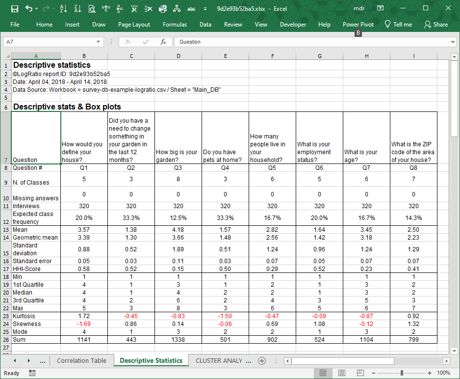
Question #. The short form of the question text. This helps to keep certain charts and reports more readable.
N. of Classes. The number of answer options built in the scale used to collect respondent answers.
Missing answers. The number of interviews missing an answer to a specific question.
Interviews. The numbers of collected answers by question.
Expected class frequency. The expected value for each class of the answer scale of a question. It is equal to 1 divided by the number of classes.
Mean. The arithmetic average of the answer class numbers of a question, as coded in sheet Main_DB of LogRatio Excel report.
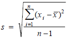
Standard deviation. This measures the average distance between a respondent answer and its mean value. It corresponds to the function STDEV.S in Excel, as opposed to STDEV.P, which returns a biased value when dealing with a sample extracted from a population, as in the case of surveys. Using n-1 in the denominator instead of n corrects for this bias. The standard deviation is influenced by outliers, and it is recommended to look for outliers in your data also using the charts in section Histograms.
Standard error. This is the standard deviation of its sampling distribution. The sampling distribution of a mean is generated by repeated sampling from the same population. For instance, 3.57 is the mean of all answer codes to question 1 of the image above. If we ask this same question, say, to 500 different samples from the same population, chances are we will get 500 different mean values. Sorting these mean values into intervals results in frequencies that represent the sampling distribution of the mean.
![]()
A common use of the standard error in surveys is to find confidence intervals. For instance, 3.57 ± (1.96 * 0.0494) returns 95% confidence limits ranging from 3.47 to 3.66. There is a 95% probability the true mean of the population this sample comes from falls in this interval.
HHI-Score. LogRatio adapted The Herfindahl index (also known as Herfindahl–Hirschman Index, HHI, or HHI-score) to measure the size of an answer class of a question in relation to all other classes.

We call it Index of Concentration and it supplies a quick idea of how skewed the distribution of respondent answers is. The closer HHI is to zero, the more normal (less skewed) the distribution of answer codes. The closer to 1, the more skewed the distribution of answer codes. The box-plots can confirm the interpretation of the HHI.
Min. The lowest answer code of an answer scale of a question used by the respondents. When dealing with coded answers to a survey it typically equals 1.
1st Quartile. Also called the 25th percentile or lower quartile, it equals the median value of the lower half of the answer codes to a question.
Median. The value in the middle of all answer codes to a question sorted in an ascendant or descendant fashion.
3rd Quartile. Also called the 75th percentile or upper quartile, it equals the median value of the upper half of the answer codes to a question.
Max. The largest answer code of an answer scale of a question.
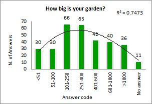
Kurtosis. This describes the shape of a probability distribution in terms of tailedness, that is, the more outliers or extreme values in the data the larger the kurtosis. Larger kurtosis indicates a more serious outlier problem. For instance, the first chart of the image in section Histograms shows high peakedness on answer code 4 and its kurtosis, 1.72, is the largest among answers of this survey.
Skewness. This is a measure of the asymmetry of the distribution of respondent answers to a question. Negative skewness commonly indicates that the tail is on the left side of the distribution, and positive skewness indicates that the tail is on the right. Confirm this by comparing the first and the last charts of the image in section Histograms.
Mode. This is the most frequently chosen answer option to a question. For instance, the mode of question 1 in the image above is 4 because the fourth answer code to this question was preferred most often by respondents, in 74.7% of all answers.
Sum. The sum of all answer codes to a question. Divided by the number of interviews, it returns the mean value.
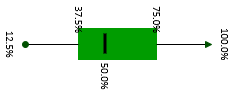
Box-Plots
A box-plot summarizes the central tendency, symmetry, skewness and outliers, if any, of a data series, for instance, like those of survey respondents in sheet Main_DB. LogRatio produces two box-plots for each closed question:
- Rescaled, in %
- Not rescaled, using the codes as in the frame code of sheet Main_DB.
We call this the Helicopter view, because looking at a boxplot is like looking at the distribution of respondent answers from above.
Similarly, the Histograms provide the Periscopic view, which is from the side. Read about histograms and compare the two views in light of what is written in this paragraph.
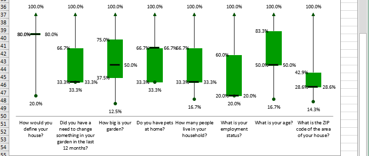
The boxplot visualizes the shape of the distribution of the answer codes to a question.
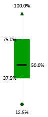
The green box in the middle accounts for 50% of the values. The ends correspond to Q1 and Q3. The dash inside the box marks the median.
The lines extending in either direction away from the box are called whiskers and mark the smallest and largest value of the distribution of answer codes of a question.
For the sake of explanation, let’s rotate the boxplot above 90 degrees to the right. Now we see the answers to this question are slightly left-skewed. This means, the distance from the median to the largest value is slightly greater than the distance from the smallest value to the median.
The histogram that follows demonstrates the relationship between the boxplot and the density curve for this particular question.
Answer Code Distribution
This section shows the marginal tables of each closed question.
For instance, range B83:B87 shows the number of respondents who chose each answer option to question “How would you define your house?”
Range B94:B98 shows the number of respondent answers in percentage relative to the 320 respondents to this question.
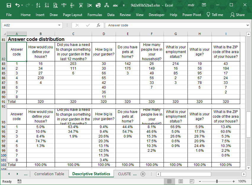
Marginal tables are rather basic output that researchers use to get a preliminary idea of the characteristics of a sample. They show, for a question, nothing other than the sum of respondent answers by class.
Most online survey providers show these values on a bar chart as their standard survey report. This is clearly not enough to conduct a professional analysis of a survey.
Spread the word about LogRatio. We advocate the correct use of survey insight as a way to enhance the quality of today’s decision-makers.
Histograms
Histograms visualize the distribution of the respondent answers to a question, that is, the distribution of respondent preferences. They show symmetry, skewness and outliers related to data series like those in sheet Main_DB.
We call this the Periscopic view, because looking at a histogram is like looking at the distribution of respondent answers from the side.
Similarly, Box-plots provide the Helicopter view, which is from above. Read more about box-plots and compare the two in light of what is written in this paragraph.
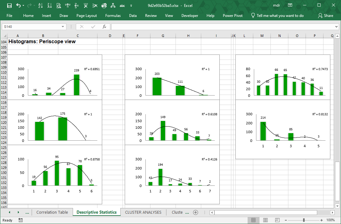
To each histogram LogRatio adds a trendline, and its coefficient of determination (R squared), to visualize the shape of the distribution of answers, which may be useful, for instance, when creating a simulation model. In this case, the coefficient of determination measures how accurately the trendline fits the distribution by class of respondent answers to a question.
In general, variables able to collect (roughly) the same number of responses in each answer class are useful to test concepts and products in comparison. While variables with skewed or peaking distributions tend to be useful for estimation and projection (inference) purposes.